
TL;DR:
- User experience focuses on usability, accessibility, and satisfaction, not just visuals.
- Simple navigation, fast load speed, and clear calls to action are key to effective UX.
- Prioritizing speed, clarity, and accessibility improves customer retention and business growth.
Most small business owners spend weeks picking fonts and colors for their new website. Then they launch it, and visitors leave within seconds. The hard truth is that 88% of users will not return to a site after a bad experience, no matter how good it looks. Web design is not just about visuals. It is about how your site feels to use. This guide breaks down what user experience really means, what makes it work, and how you can apply it to your Texas small business website without a big budget or a tech background.
Table of Contents
- What is user experience in web design?
- Key elements of great user experience
- User-centered design: Methodologies and common mistakes
- Solving for edge cases: Accessibility, mobile, and messy realities
- What most web designers miss about real-world user experience
- Bring better user experience to your small business website
- Frequently asked questions
Key Takeaways
| Point | Details |
|---|---|
| User experience explained | UX is how customers feel navigating and using your site, not just about looks. |
| Essential elements | Fast load, clear navigation, accessibility, and mobile readiness define great user experience. |
| Affordable improvements | Simple templates, testing with 3-5 people, and focusing on basics yield big results without high cost. |
| Accessibility matters | One in four adults benefits from accessibility; it’s crucial for legal and business reasons. |
| Huge ROI potential | Every dollar invested in user experience can return $2 to $100 for your business. |
What is user experience in web design?
User experience, or UX, is one of those terms that gets thrown around a lot. But most people misunderstand it. They think it means making a website look modern or using the right color scheme. That is only a small part of the picture.
User experience in web design is the overall journey and feelings a visitor has when interacting with your site. It covers usability, accessibility, and satisfaction rather than just visual aesthetics. Think of it this way: a beautiful store with confusing aisles and no staff will still lose customers. Your website works the same way.
Here is what UX actually covers in practice:
- Usability: Can visitors find what they need quickly and without frustration?
- Accessibility: Can people with disabilities, slow internet, or older devices still use your site?
- Navigation: Is the menu clear? Are links easy to spot and click?
- Trust: Does your site look credible? Are your contact details easy to find?
- Efficiency: How many steps does it take to reach your phone number or booking form?
According to research from Nielsen Norman Group, web UX covers viewing behaviors, forms, navigation, and accessibility, and following established standards prevents confusion for your visitors. These are not optional extras. They are the foundation of a site that actually works for your business.
"UX is not a feature you add at the end. It is the entire experience your customer has with your brand online."
You can also explore design terminology explained if some of these concepts feel unfamiliar. Understanding the vocabulary helps you make better decisions when working with a designer or evaluating your current site. The Squarespace UX guide is another useful starting point for plain-language explanations.
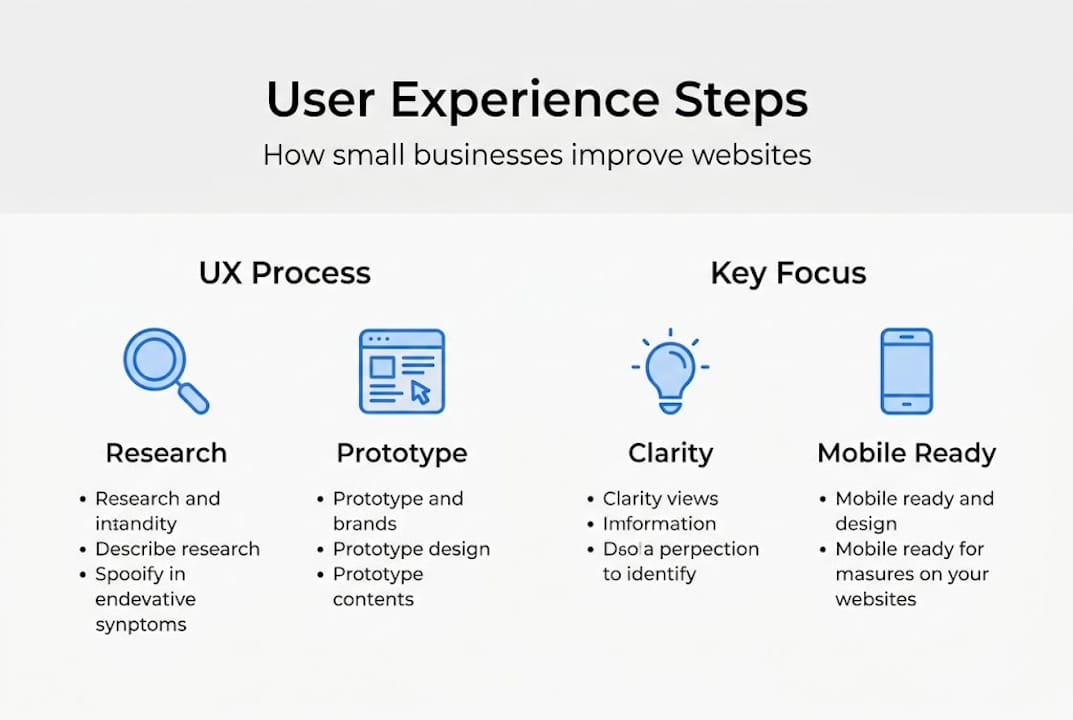
Key elements of great user experience
Now that you understand what user experience is, let's see what makes for a truly effective website in practice. Great UX does not require a massive budget. It requires the right priorities.

The key mechanics of UX include information architecture, user flows, interaction design, wireframing, prototyping, and usability testing in an iterative process. For a small business owner, that translates into a few practical building blocks.
| UX Element | What it means for your business | Affordable fix |
|---|---|---|
| Simple navigation | Visitors find pages in 2 clicks or less | Clear menu with 5 items or fewer |
| Fast load speed | Pages load in under 3 seconds | Compress images, use good hosting |
| Mobile-responsive design | Site works on phones and tablets | Use a mobile-first design approach |
| Clear calls to action | Visitors know what to do next | One bold button per page |
| Trust signals | Visitors feel safe and confident | Add reviews, photos, and contact info |
Templates with mobile-first, fast loads, and clear CTAs boost engagement affordably, even for businesses with no design experience. The key is not to overcomplicate things. A clean, fast, easy-to-navigate site will outperform a flashy but confusing one every time.
Here are the elements most Texas small business sites get wrong:
- Menus with too many options (more than 7 items confuses visitors)
- No visible phone number or contact button on mobile
- Slow-loading images that push visitors away before the page finishes
- Calls to action buried at the bottom of long pages
Pro Tip: Test your site on your phone right now. Try to find your own phone number or booking form in under 10 seconds. If you struggle, your customers will too.
For a full breakdown of what your site needs, the website design guide covers practical steps tailored to Texas businesses. You can also explore modern websites that grow Texas businesses for real-world examples. The UX Design Institute overview is a solid external resource if you want to go deeper.
User-centered design: Methodologies and common mistakes
Building on those elements, let's unpack the process of creating an effective user experience and discover the pitfalls to avoid. The most widely used approach is called Design Thinking. It is a five-step process used by professional UX designers, and it applies just as well to a small business website.
The user-centered design process follows these steps:
- Empathize: Talk to your actual customers. What do they look for when they visit your site?
- Define: Identify the real problem. Is it that people cannot find your prices? Cannot book online?
- Ideate: Brainstorm solutions. Could a simple FAQ page answer common questions?
- Prototype: Build a rough version. A quick mockup or even a sketch works at this stage.
- Test: Show it to 3-5 real people and watch how they use it.
The UX design process is user-centered: empathize through research, define problems, ideate solutions, prototype, and test iteratively. This cycle repeats. Each round makes your site more useful.
A common misconception is that UX equals aesthetics only. This is the mistake most small business owners make when they hire someone to "make the site look better" without fixing the underlying usability issues.
Here are the biggest UX mistakes to avoid:
- Guessing what your customers want instead of asking them
- Ignoring accessibility for users with visual or motor impairments
- Prioritizing looks over speed and clarity
- Skipping mobile testing entirely
- Using industry jargon that confuses regular visitors
Pro Tip: Ask three people who have never seen your site to find your most important service page. Watch where they click and where they get stuck. You will learn more in 10 minutes than from hours of guessing.
You can also review design terminology explained to better understand the language designers use when proposing changes to your site.
Solving for edge cases: Accessibility, mobile, and messy realities
Beyond proven processes, there are often-overlooked details that keep users engaged and your business safe. These are called edge cases, and they represent real situations your visitors face every day.
Start with accessibility. 25% of adults have disabilities and accessibility is not optional. It is both a legal consideration and a business opportunity. If your site cannot be used with a keyboard, a screen reader, or high-contrast settings, you are turning away a significant portion of potential customers.
"An accessible website is not just the right thing to do. It is good business."
Edge cases in web design include accessibility features like WCAG compliance, keyboard navigation, and screen reader support, as well as mobile responsiveness, slow connections, error recovery, and offline use. These are not rare situations. They happen every day.
Here is a practical checklist for your site:
- Add alt text to every image so screen readers can describe them
- Use readable font sizes (at least 16px for body text)
- Ensure color contrast is strong enough for low-vision users
- Make sure all buttons and links work with keyboard navigation alone
- Add a keyboard accessibility focus indicator so users can see where they are on the page
- Test your site on a slow 3G connection to see how it performs
For mobile, your site needs to do more than just resize. Buttons need to be large enough to tap. Text needs to be readable without zooming. Forms need to work without a mouse. The mobile responsive design workflow covers these steps in detail. You can also explore responsive web development for a deeper look at how this works technically.
Testing with just 3-5 users reveals 80% of usability problems. You do not need a big research budget. Ask a neighbor, a family member, or a regular customer to click through your site and tell you what confuses them.
What most web designers miss about real-world user experience
Here is a perspective business owners rarely hear when shopping for website solutions. Most web designers focus on portfolio-worthy visuals. They want your site to look impressive in a screenshot. But your customers are not looking at screenshots. They are trying to find your address at 8pm on a cracked phone screen with one bar of signal.
We have worked with Texas small businesses where the fanciest website in their industry was also the slowest and hardest to use. Their competitors with simpler, faster sites were winning more calls and more walk-ins. Simple, fast, and accessible always wins over fancy features when your customer just needs to reach you.
Overcomplicating UX backfires. Every animation, popup, and auto-playing video you add is another reason for a visitor to leave. The best UX for a small business is often invisible. It just works. You can see this in action with modern website tips for Texas businesses that prioritize function over flash.
If you are not a developer, that is fine. Focus on three things: speed, clarity, and one clear action per page. Everything else is secondary.
Bring better user experience to your small business website
Ready to put this advice into action? Here is how we help Texas small businesses thrive online.
At Digital Biz Agent, we build websites that are fast, mobile-ready, and easy for your customers to use. We start by understanding your business, then design for free, and launch with ongoing support. Our plans start at $50/month for a full website, and we can have you online in as little as one week. Check out the essentials for small business websites to see what a strong foundation looks like. Explore our affordable website design services or learn why a website matters for your business growth today.
Frequently asked questions
What are the main benefits of good user experience for a small business website?
Good user experience increases customer trust, boosts retention, and can raise conversion rates by up to 400%. It also reduces bounce rates and keeps visitors on your site longer.
How can I make my website more accessible for all users?
Use readable text, proper color contrast, alt text for images, and focus-visible keyboard navigation so all users can move through your site. Test with real people, including those with disabilities.
What is the difference between UX and UI in web design?
UX is about how the site works and how users feel when using it, while UI focuses on the visual design elements like colors, fonts, and layout. Both matter, but UX drives results.
How much does investing in UX really pay off for small businesses?
For every $1 invested in user experience, the return can reach $2 to $100 over time, making it one of the highest-return investments a small business can make.
How many users do I need to test my site with to find most usability problems?
Testing with just 3-5 users uncovers about 80% of usability issues, so you do not need a large research budget to get meaningful results.