
TL;DR:
- Mobile responsive design ensures websites automatically adapt to all screen sizes and devices.
- Proper testing on real devices and browsers is essential for optimal mobile functionality.
- Most small business sites fail mobile due to poor priorities, not bad code.
A Texas customer pulls up your website on their phone, and the text is tiny, the buttons are impossible to tap, and the page scrolls sideways. They leave in seconds. This happens more than most business owners realize, and it costs real money. A mobile responsive design workflow fixes this by making your site look and work great on every screen size. This guide walks you through the tools, steps, testing process, and common fixes you need to build a site that serves your Texas customers well, no matter what device they use.
Table of Contents
- How to prepare for a mobile responsive design workflow
- Step-by-step: The modern mobile responsive design workflow
- Testing and optimizing for real-world devices
- Troubleshooting: Common responsive pitfalls and edge cases
- Why most small business sites get mobile responsive design wrong
- Get an affordable, modern mobile responsive website with expert help
- Frequently asked questions
Key Takeaways
| Point | Details |
|---|---|
| Start mobile-first | Design for the smallest screens before adding features and layouts for larger ones. |
| Use fluid tools | Build with flexible grids, images, and fluid typography so your site looks great everywhere. |
| Test on real devices | Always check your site using actual phones and tablets to catch issues emulators miss. |
| Optimize for speed | Prioritize fast loading by lazy-loading images and only using necessary code. |
| Ongoing improvement | Responsive design is an ongoing process, not a one-time fix—keep updating and testing. |
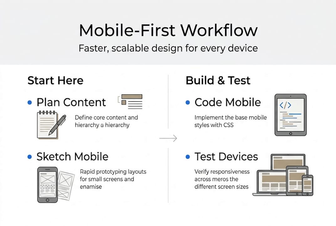
How to prepare for a mobile responsive design workflow
Before you write a single line of code or click a single button in a website builder, you need to understand what mobile responsive design actually means. It is not just making your site "look okay" on a phone. It means your layout, images, text, and navigation all adjust automatically based on the screen size of the device your visitor is using.
The foundation of this approach is the mobile-first method. Mobile-first design starts with the smallest screen, using base CSS for mobile, then enhancing for larger screens. This is the opposite of how many older sites were built. Instead of shrinking a desktop layout down, you build up from mobile. This approach keeps things lean and fast, which matters for Texas customers browsing on the go.
You also need the right tools. Here is a quick overview of what you will use:
| Tool | Purpose | Free or Paid | Beginner Friendly |
|---|---|---|---|
| VS Code | Write and edit code | Free | Yes |
| Chrome DevTools | Test layouts at different screen sizes | Free | Yes |
| BrowserStack | Test on real device environments | Paid (free trial) | Moderate |
| Figma | Design mockups before building | Free tier available | Yes |
| Google Lighthouse | Audit performance and accessibility | Free | Yes |
Once you have your tools ready, take these setup steps before you start building:
- Set your viewport meta tag in every HTML page so browsers know to scale correctly
- Choose a CSS reset or normalize file to remove browser style differences
- Decide on your breakpoints early, typically 320px, 768px, and 1024px as starting points
- Review your content and rank it by importance for mobile users
- Check out Texas website design basics to align your setup with local business needs
You can also use your responsive website checklist to make sure nothing gets missed during setup.
Pro Tip: If you do not have multiple physical devices to test on, use free browser-based emulators like Chrome DevTools or Responsively App. They let you preview your site at dozens of screen sizes without buying extra hardware.
Step-by-step: The modern mobile responsive design workflow
With your foundation and tools in place, you are ready to move into the actual build. Follow these steps in order. Skipping ahead creates problems that are harder to fix later.
- Write your mobile-first CSS base. Start with styles that apply to small screens. No media queries yet. Just clean, readable defaults.
- Build your fluid grid. Use CSS Grid or Flexbox to create columns that resize based on available space, not fixed pixel widths.
- Make images flexible. Set images to "max-width: 100%` so they never overflow their containers.
- Add container queries. Container queries let components respond to their own container size, not just the viewport. This is a game changer for reusable components.
- Apply fluid typography. Use
clamp()to set font sizes that scale smoothly between a minimum and maximum value. Fluid typography with clamp reduces the need for multiple font-size declarations across breakpoints. - Add media queries last. Layer in adjustments for tablet and desktop only after your mobile base is solid.
The responsive web development guide covers these mechanics in more depth if you want to go further. You can also explore modern website features that pair well with a responsive workflow.
Here is how responsive design compares to adaptive design, which some older sites still use:
| Approach | Pros | Cons | Maintenance |
|---|---|---|---|
| Responsive | One codebase, flexible, future-proof | Requires careful planning | Lower, one site to update |
| Adaptive | Precise control per device | Multiple layouts to maintain | Higher, each layout needs updates |
Core responsive design mechanics include fluid grids, flexible images, and container queries for component-level responsiveness. Responsive is the clear winner for small businesses that want a site that lasts.
Pro Tip: Before you finalize any layout, decide what your mobile visitor needs most. Put that content at the top. Phone numbers, hours, and a clear call to action should never be buried below the fold on a small screen.
Testing and optimizing for real-world devices
Executing your workflow is not complete until you know how it performs on real devices where your customers are. Testing is not optional. It is the step that separates a site that looks good in screenshots from one that actually works.

Mobile traffic now exceeds 60% globally, and strong responsive design can boost mobile conversion rates by 20 to 35%. For a Texas small business, that gap between a well-optimized and a poorly optimized site can mean the difference between a new customer and a lost one.
Here is how to test properly:
- Real devices first. Test on at least one Android phone and one iPhone. Behavior varies between operating systems.
- Chrome DevTools. Use the device toolbar to simulate dozens of screen sizes. Check for layout breaks at every major breakpoint.
- Google Lighthouse audit. Run this from DevTools to get scores on performance, accessibility, and best practices. Aim for 90 or above.
- Cross-browser testing. Check Safari, Chrome, and Firefox. Safari on iOS handles some CSS differently than Chrome on Android.
- Check your responsive design SEO impact. Google uses mobile-first indexing, so a broken mobile layout hurts your search rankings too.
"Test on real devices. There is no substitute for how customers truly experience your site."
For performance, apply these optimizations after testing:
- Lazy-load images so they only load when the user scrolls to them
- Inline critical CSS so the above-the-fold content loads instantly
- Defer non-essential JavaScript so the page is usable before all scripts run
Use your mobile-responsive checklist during this phase to verify every item is covered before you go live.
Troubleshooting: Common responsive pitfalls and edge cases
Optimizing for the real world inevitably reveals tricky issues. Even well-built sites run into these problems. Knowing what to look for saves you hours of frustration.
Common problems and how to fix them:
- Horizontal scroll. Usually caused by an element with a fixed width wider than the screen. Set
overflow-x: hiddenon the body and find the offending element with DevTools. - Breakpoints that feel wrong. Do not set breakpoints based on device names. Set them based on where your content starts to look broken.
- Images not scaling. Missing
max-width: 100%on the image or its parent container. Add it and the problem resolves immediately. - Tap targets too small. Touch targets should be at least 44 to 48px so users can tap accurately. Buttons and links that are too small frustrate users and increase bounce rates.
- Key info hidden on mobile. If important content is in a sidebar or below a long intro section, mobile users may never see it. Restructure your layout to surface it early.
Edge cases that are easy to overlook:
- Orientation changes. Test your site in both portrait and landscape mode on phones and tablets. Some layouts break when the device rotates.
- Foldable devices. These are growing in popularity. Check that your layout does not collapse awkwardly on a narrow fold.
- Hover-only interactions. If a menu or tooltip only appears on hover, it is invisible on touchscreens. Replace hover-only interactions with tap-friendly alternatives.
Pro Tip: Go through your mobile layout and remove or relocate anything that is not essential. A cluttered mobile page slows loading and confuses visitors. Less is more on small screens.
For more context on why these fixes matter for your business, see the responsive design advantages and custom web design strategies that work for Texas businesses.
Why most small business sites get mobile responsive design wrong
Here is the honest truth. Most small business sites fail at mobile not because of bad code, but because of bad priorities. Owners and designers focus on how the desktop version looks and treat mobile as an afterthought. They pick breakpoints based on popular device names instead of where the content actually breaks. They add animations and large images without checking load times on a 4G connection.
The fix is simpler than most people expect. Start with content. Decide what your customer needs to do on your site in under 10 seconds. Then build your mobile layout around that single goal. Speed matters more than style. A fast, clear site outperforms a beautiful, slow one every time.
Mobile responsive design is also not a one-time task. Browsers update, new devices appear, and your content changes. Build a habit of checking your site on a phone every few months. Small issues are easy to fix early and expensive to fix after they have driven customers away.
Follow modern web design trends to stay current, but never let trends override the basics of speed and clarity.
Get an affordable, modern mobile responsive website with expert help
Building a mobile responsive site the right way takes time, testing, and ongoing attention. If you are running a business in Texas, that time is often better spent serving your customers.

At Digital Biz Agent, we handle the entire process for you. From design to launch to ongoing maintenance, our team builds mobile responsive web design services that are fast, modern, and built to convert. We start with a free demo so you can see exactly what your site will look like before you commit. Our plans start at $50 per month for a full website. Review the website essentials for Texas businesses to see what a strong site includes, and learn why websites are vital for your growth in 2026.
Frequently asked questions
What is a mobile responsive design workflow?
It is a process that ensures your website automatically adapts to different screen sizes. A mobile-first responsive workflow starts with the smallest screen and progressively enhances for larger devices.
How do I test if my website is truly mobile responsive?
Test on multiple real devices and browsers, not just online emulators. Real device testing is the only reliable way to confirm your layout and functions work at every common breakpoint.
What are common problems with mobile responsive websites?
Typical issues include images or text not scaling, buttons too small to tap, and key info buried below the fold. Touch targets under 44px and hover-only interactions are also frequent problems on mobile.
Can responsive design improve my business results?
Yes. Mobile optimization boosts conversions by 20 to 35%, and with mobile traffic accounting for 60 to 63% of all web visits, a responsive site is essential for staying competitive.