
TL;DR:
- Mobile-first design improves user experience and boosts conversion rates by prioritizing mobile needs.
- It results in faster load times and better SEO performance compared to desktop-first approaches.
- Small businesses benefit from more engaged visitors, lower bounce rates, and higher search rankings through mobile-first strategies.
Over 60% of web traffic now comes from mobile devices, yet many small business websites are still built with a desktop screen in mind first. That disconnect costs you customers. Mobile-first design flips the traditional approach: you start with the smallest screen and build up from there. The result is a faster, cleaner, and more usable experience for the people most likely to find you online. In this article, you will learn what mobile-first design is, how it works step by step, how it compares to desktop-first, and what real business results it delivers.
Table of Contents
- What is mobile-first design?
- How mobile-first design works in practice
- Comparing mobile-first and desktop-first: Which approach wins?
- The business impact: Results from adopting mobile-first design
- Expert insights: Limitations and when mobile-first isn't enough
- Rethinking mobile-first: What really drives results for local businesses
- Get mobile-first results with our proven web design solutions
- Frequently asked questions
Key Takeaways
| Point | Details |
|---|---|
| Start mobile, scale up | Design for the smallest screen first to guarantee essential usability everywhere. |
| Boost performance and conversions | Mobile-first sites load faster, lower bounce rates, and convert more visitors. |
| Prioritize customer intent | Put real user needs first for every device, not just following trends. |
| Test on real devices | Always check your website on actual smartphones to catch hidden issues. |
What is mobile-first design?
Mobile-first design is a web development strategy that prioritizes the mobile user experience before anything else. Instead of designing a full desktop site and then shrinking it down, you start small and scale up. As GeeksForGeeks explains, mobile-first design starts with the smallest screen in mind and builds up.
This approach rose to prominence as smartphone usage overtook desktop browsing. For small businesses, that shift is not just a trend. It is your reality. Most of your customers are searching for you on their phones while commuting, waiting in line, or sitting on the couch.
The core methodology involves three key ideas:
- Content prioritization: You decide what matters most and show only that on mobile.
- Wireframing for mobile widths: Your layout starts at around 375 pixels wide, the size of a common smartphone screen.
- Progressive enhancement: You add more features and complexity as screen size grows.
This is the opposite of the traditional desktop-first approach, which designs for large screens and then tries to remove or rearrange elements for smaller ones. That method often results in cluttered mobile pages and slow load times.
"Design for mobile first. Then add layers of complexity for larger screens. Never the other way around."
For a deeper look at how this fits into your overall strategy, our web design guide for Texas small businesses covers the full picture. You can also review the BrowserStack guide for a technical breakdown of the methodology.
How mobile-first design works in practice
Knowing what mobile-first design means, let us walk through exactly how it is applied to your business website. The process starts with a content audit, single-column layouts, bottom CTAs, and ends with progressive enhancement.
Here is a practical step-by-step breakdown:
- Audit your content. List every element on your site. Ask: does a mobile user need this right now? Cut what is not essential.
- Wireframe at 375px. Sketch your layout at smartphone width. Use a single column. No sidebars.
- Write base CSS for mobile. Your default stylesheet targets small screens. No screen-size assumptions baked in.
- Add min-width media queries. Use CSS breakpoints like "min-width: 768px` to layer in tablet and desktop styles on top.
- Design touch-friendly buttons. Touch targets should be at least 44 to 48 pixels tall and wide. Anything smaller frustrates users.
- Place CTAs in the thumb zone. The bottom third of a phone screen is where thumbs naturally rest. Put your most important actions there.
One trap many business owners fall into is trying to match every desktop feature on mobile. Resist that. Your mobile site does not need to do everything. It needs to do the right things well.

Pro Tip: Test your site on a real phone, not just your browser's mobile preview. What looks fine on screen can feel broken in your hand.
For more on building this out correctly, our mobile responsive workflow guide walks through each phase. You can also explore our notes on responsive web development for small businesses.
Comparing mobile-first and desktop-first: Which approach wins?
But what makes mobile-first a better fit than desktop-first for most small businesses? Here is a direct comparison so you can decide for yourself.
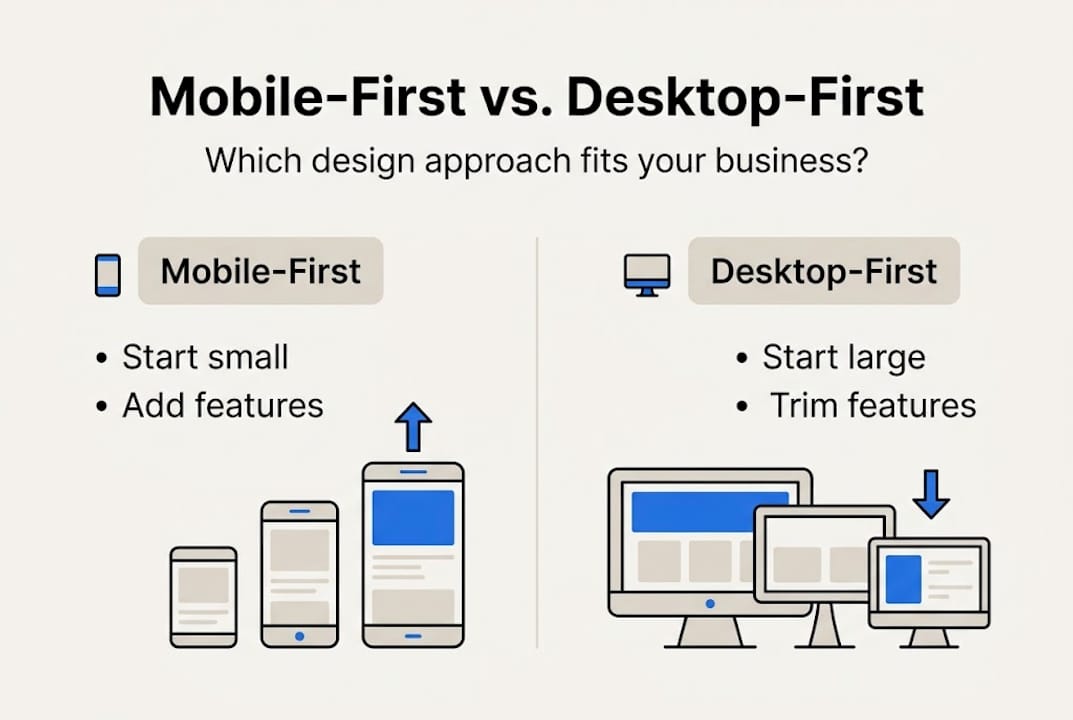
Desktop-first starts with large screens and strips features away for mobile, often resulting in poor mobile experiences. Mobile-first does the opposite: it builds up from the essentials.
| Factor | Mobile-first | Desktop-first |
|---|---|---|
| Starting point | 375px mobile screen | 1440px desktop screen |
| Approach | Progressive enhancement | Graceful degradation |
| Mobile performance | Faster load times | Often slower on mobile |
| SEO impact | Stronger mobile rankings | Can hurt mobile SEO |
| User experience | Optimized for most users | Optimized for fewer users |
| Development effort | Front-loaded, cleaner | Can create technical debt |
The business impacts are real. A desktop-first site that loads slowly on mobile will push visitors away before they ever read your offer. Mobile-first sites tend to keep users engaged longer because the experience feels natural on the device they are using.
Key advantages of mobile-first for small businesses:
- Lower bounce rates from mobile visitors
- Better Google search rankings due to mobile-first indexing
- Cleaner, faster code that benefits all screen sizes
- More focused content that converts better
For a closer look at how design choices affect your search visibility, see our article on responsive design and SEO. You can also review Figma mobile-first insights for additional data points.
The business impact: Results from adopting mobile-first design
Let us see how these design choices affect real business outcomes, not just visuals.
Mobile-first sites load 40% faster and see 23% more conversions. Those are not small gains. For a local business getting 500 monthly visitors, a 23% conversion lift could mean dozens of additional calls, form fills, or purchases every month.
| Metric | Mobile-first site | Desktop-first site |
|---|---|---|
| Page load speed | Up to 40% faster | Baseline |
| Conversion rate | Up to 23% higher | Baseline |
| Bounce rate | Significantly lower | Higher on mobile |
| Mobile SEO ranking | Improved | Often penalized |
Mobile traffic now makes up 60 to 72% of web visits. That means the majority of people landing on your site are judging it from a phone screen. If your site is slow or hard to navigate on mobile, most of your traffic is already having a bad experience.
Pro Tip: Use Google's PageSpeed Insights tool to check your current mobile load score. A score below 50 means you are likely losing customers before they see your offer.
Small businesses that switch to mobile-first design report more time spent on site, lower exit rates, and higher engagement on key pages like contact and services. The responsive design statistics back this up consistently.
For a full list of what your site should include, check our modern website features guide and our mobile-responsiveness checklist built specifically for Texas businesses.
Expert insights: Limitations and when mobile-first isn't enough
No approach is perfect. It is critical to know the limits so you can avoid the common traps experts warn about.
Mobile-first works well for most small business websites: service pages, landing pages, local business listings, and simple e-commerce. But it is not always the right fit. As LinkedIn analysis shows, complex features are harder to scale on mobile, and some business models need desktop-first or intent-first design.
Here are the key limitations to watch for:
- Complex navigation: Multi-level menus and large product catalogs are harder to organize on small screens.
- Hidden menus: Hamburger menus reduce discoverability and can hurt conversion on certain site types.
- Form completion rates: Long forms perform worse on mobile. If your business relies on detailed intake forms, desktop users may convert better.
- Data-heavy tools: Dashboards, spreadsheets, and analytics platforms are built for desktop environments.
"Intent-first design asks: what is the user trying to accomplish, and on what device? That question should drive every layout decision."
Emulator testing is another common pitfall. Testing your site in a browser's mobile view catches maybe 40% of real issues. Physical device testing catches the rest. See this expert analysis for a deeper look at where mobile-first falls short.
If your business needs a more tailored approach, our custom website design service is built around your specific goals, not a one-size-fits-all template.
Rethinking mobile-first: What really drives results for local businesses
With the key limits in mind, here is our take on how small business owners should really approach design decisions in 2026.
Mobile-first is a sound strategy. But copying it blindly because it is the industry standard can backfire. We have seen businesses apply mobile-first principles and still struggle because they never asked a more basic question: what does my specific customer actually need when they land on my site?
A plumber's customer needs a phone number fast. A wedding photographer's customer wants to browse a gallery. A tax preparer's client needs to fill out a form. Each of those needs demands a different layout priority, not just a different screen size.
The real win is aligning your design with your audience's habits and goals. Mobile-first gives you a strong foundation. But intent-first thinking is what turns a good-looking site into one that actually grows your business.
Test your site with real users. Measure what they click. Iterate based on data, not assumptions. Our website growth tips go deeper on this approach for local businesses ready to grow.
Get mobile-first results with our proven web design solutions
Ready to take action? Here is how you can get expert help to ensure your business stands out on every device.

At Digital Biz Agent, our website design and SEO services are built around mobile-first principles from day one. We design for your customers' real habits, not just a checklist. Every site we build is fast, mobile-responsive, and optimized to convert visitors into paying customers. Plans start at $50/month with no large upfront costs. Before you commit, review our small business website essentials to see exactly what a high-performing site needs. Then reach out. We will show you a free demo of what your site could look like.
Frequently asked questions
Why is mobile-first design important for small businesses?
Mobile traffic exceeded 60% of all web visits in 2026, so a mobile-first site ensures most of your visitors get a smooth, fast experience that keeps them engaged and more likely to contact you.
Does mobile-first design mean my desktop website will look worse?
No. Progressive enhancement improves the experience on desktops after perfecting the mobile version, so your desktop site stays polished and fully functional.
What's the first step to building a mobile-first website?
Begin with content prioritization and single-column layouts. Identify what your mobile visitor needs most, then design around that before adding anything else.
Are there business types where mobile-first isn't the best fit?
Yes. Intent-first is advised for complex workflows, data dashboards, or task-heavy tools where most users access the site from a desktop environment.
How can I test if my website is truly mobile-friendly?
Physical device testing catches up to 60% more usability issues than emulators, so always test on an actual smartphone before calling your site mobile-ready.