
TL;DR:
- Over 60% of web traffic comes from mobile, making responsive design essential for small businesses.
- Responsive web development uses flexible layouts and media queries to ensure sites look good on all devices.
- Proper responsiveness boosts SEO, increases conversions, and enhances user experience, vital for local success.
Over half of your potential customers are browsing on a phone right now. In fact, 63% of web traffic now comes from mobile devices. If your website looks broken, loads slowly, or forces visitors to pinch and zoom, they leave. Fast. Responsive web development is the solution that makes your site look sharp and work correctly on every screen, from a tiny smartphone to a wide desktop monitor. For small businesses in Lubbock competing for local attention, this is not optional anymore. This article walks you through exactly what responsive web development is, how it works, and why it directly affects your leads and revenue.
Table of Contents
- What is responsive web development?
- How responsive design works: Core elements and tools
- Why responsive web design matters for Lubbock small businesses
- Responsive vs adaptive design: What's right for your business?
- Best practices and common pitfalls in responsive web development
- Why doing 'just enough' on mobile is a risky mistake for small businesses
- Ready to modernize your business website for mobile success?
- Frequently asked questions
Key Takeaways
| Point | Details |
|---|---|
| Mobile-first matters | Designing for mobile devices first ensures your website reaches most local customers effortlessly. |
| Single site simplicity | A responsive website means less maintenance and better performance across all devices—even for non-technical owners. |
| SEO and sales boost | Responsive web development helps your local business rank higher and convert more leads from mobile traffic. |
| Avoid costly mistakes | Testing and following best practices prevent common problems hurting your users and your reputation. |
What is responsive web development?
Responsive web development means building one website that automatically adjusts its layout, text, and images to fit any screen size. You do not need a separate mobile site. You do not need to manage two different versions of your content. One site. Every device. Always readable.
Let's break down the key terms you will hear:
- Viewport meta tag: A small line of code that tells a browser how to scale your page on a mobile screen. Without it, your site looks like a shrunken desktop page.
- Fluid grids: Layouts built with percentages instead of fixed pixel widths. Elements resize proportionally as the screen changes.
- Media queries: CSS rules that apply different styles at different screen sizes. Think of them as instructions that say "if the screen is smaller than 768px, stack these columns vertically."
- Breakpoints: The specific screen widths where your layout changes. Common breakpoints target phones, tablets, and desktops.
- CSS Grid and Flexbox: Modern layout tools that make building flexible, multi-column designs much simpler and cleaner.
Responsive web design makes sites render well on all screen sizes using flexible grids, images, media queries, and viewport tags. The key technical components include the viewport meta tag, fluid grids, flexible images, media queries, CSS Grid, and Flexbox.
Now, what is the difference between "responsive," "mobile-friendly," and a "mobile site"? A mobile-friendly site might just shrink content down without truly reorganizing it. A separate mobile site is a second website built specifically for phones, usually at an "m." subdomain. Responsive design is the modern standard. It is one site, built smart, that works everywhere. For small business owners who want simplicity and value, learning modern web design basics is the best starting point.
Pro Tip: Start with a mobile-first approach. Design for the smallest screen first, then scale up. This forces you to prioritize what matters most to your visitors and avoids cluttered layouts on phones.
How responsive design works: Core elements and tools
Here is a step-by-step look at how a responsive site adapts as a visitor switches devices:
- The browser reads the viewport meta tag and sets the correct display width.
- The fluid grid system calculates element widths as percentages of the screen.
- Media queries detect the screen size and apply the matching CSS rules.
- Images scale down using max-width settings so they never overflow their containers.
- The layout shifts at defined breakpoints, stacking or reorganizing content for readability.
Here is a quick reference for common breakpoints:
| Breakpoint | Screen width | Target device |
|---|---|---|
| Extra small | Below 576px | Small phones |
| Small | 576px to 767px | Large phones |
| Medium | 768px to 991px | Tablets |
| Large | 992px to 1199px | Laptops |
| Extra large | 1200px and above | Desktops |
The core mechanics include viewport tags, fluid grids, flexible images, media queries, CSS Grid, and Flexbox working together. You do not need to code all of this from scratch. Frameworks like Bootstrap or W3.CSS make responsive design accessible even for non-technical business owners working with a developer.

Fluid images are set with a simple CSS rule: max-width: 100%. This means an image will never be wider than its container, so it scales naturally on any device. Testing is just as important as building. Use Google's free Mobile-Friendly Test tool, resize your browser window manually, and check your site on actual phones and tablets.
Before launching, review this responsive checklist for Texas SMBs and confirm you have covered the essential website features your visitors expect.
Pro Tip: Test your site on at least three real devices, not just browser simulators. Simulators miss touch behavior, font rendering issues, and real-world load speeds.
Why responsive web design matters for Lubbock small businesses
Understanding the mechanics is great, but why does responsive really matter for small businesses here in Lubbock?
First, Google cares. A lot. Google uses mobile-first indexing, meaning it crawls and ranks the mobile version of your site. If your mobile experience is poor, your search ranking suffers. Lower ranking means fewer people find you when searching for local services.
Second, your customers care even more. Here is what the data shows:
- Responsive sites boost conversions by 11 to 20% and reduce bounce rates by 25%.
- Visitors who have a bad mobile experience are unlikely to return or recommend your business.
- Google recommends responsive design over separate mobile sites for SEO advantages and simpler site management.
"A poor mobile experience is not just a technical problem. It is a lost customer."
For a Lubbock restaurant, contractor, boutique, or service provider, this is real money. If a potential customer finds your competitor's site loads cleanly on their phone while yours does not, you already lost that lead. Responsive design directly connects to your SEO and sales impact and is a core part of any solid local SEO guide.
The benefits stack up fast: higher search rankings, more time spent on your site, lower bounce rates, more contact form submissions, and stronger trust from first-time visitors. For a small business with a tight marketing budget, responsive design gives you the most return per dollar spent on your website.
Responsive vs adaptive design: What's right for your business?
There is one more wrinkle: what is the difference between responsive and adaptive design, and which is right for your site?
Responsive design is fluid. The layout stretches and shrinks continuously based on the screen size. One set of code handles everything.
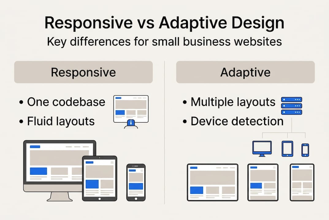
Adaptive design uses multiple fixed layouts built for specific screen sizes. The server detects the device and delivers the matching layout. It does not flow between sizes; it snaps to the closest preset.
Here is a side-by-side comparison:
| Factor | Responsive | Adaptive |
|---|---|---|
| Maintenance | One codebase | Multiple layouts to update |
| SEO impact | Strong, Google preferred | Weaker, can cause duplicate content |
| Cost | Lower long-term | Higher to build and maintain |
| Speed | Good with optimization | Can be faster for specific devices |
| Best for | New sites, SMBs | Older sites needing a retrofit |
Responsive is fluid, SEO-friendly, and preferred for new sites. Adaptive can be faster and more controlled for retrofits but is usually less SEO-optimized.
For most Lubbock small businesses, responsive is the clear choice. Here is a simple checklist to help you decide:
- Are you building a new site? Choose responsive.
- Do you need strong local SEO? Choose responsive.
- Is your current site very old and a full rebuild is not possible yet? Adaptive might work short-term.
- Do you want one easy-to-manage codebase? Choose responsive.
- Is your primary audience on mobile? Definitely choose responsive.
Explore website optimization tips and affordable site upgrades to understand your next steps based on where your current site stands.
Best practices and common pitfalls in responsive web development
With the options clear, here is how to get responsive design right and avoid common traps facing Lubbock small businesses.
Do these things:
- Add the viewport meta tag to every page.
- Use relative units like percentages and em values instead of fixed pixels.
- Set images to scale with max-width: 100%.
- Make all tap targets at least 44x44 pixels so fingers can tap buttons easily.
- Test on real devices across Android and iOS.
- Check both portrait and landscape orientations.
- Optimize images for fast load times on mobile networks.
Avoid these pitfalls:
- Fixed-width layouts that break on smaller screens.
- Text that is too small to read without zooming.
- Skipping real device testing and relying only on browser tools.
- Slow page loads caused by uncompressed images or too many scripts.
- Pop-ups that cover the entire screen on mobile.
Touch targets, orientation handling, and skipping device tests are the most common pitfalls in responsive builds. Shockingly, 62% of SMBs still lack full responsiveness on their sites in 2026.
"If you have not tested your site on a real phone recently, you do not actually know what your customers see."
Start with Google's free Mobile-Friendly Test. It takes 30 seconds and gives you a clear pass or fail. Then review the client-focused web tips built specifically for Lubbock business owners.
Pro Tip: After every update to your site, re-test on mobile. Even small content changes can break layouts or slow load times if images are not properly sized.
Why doing 'just enough' on mobile is a risky mistake for small businesses
Here is something most web guides will not tell you plainly: passing Google's Mobile-Friendly Test does not mean your mobile experience is actually good.
"Mobile-friendly" is a minimum bar. It means your site does not fail basic checks. It does not mean visitors enjoy using it, trust it, or convert on it. We see this constantly with Lubbock businesses that had a site built years ago and added a quick mobile fix. The site passes the test. But buttons are hard to tap, text is cramped, and the checkout or contact flow is frustrating on a phone.
Businesses that invest in true responsiveness, with clean layouts, fast loads, and intuitive touch navigation, pull ahead. They earn return visits. They rank higher. They get more calls. The businesses that do just enough often spend more money later fixing a poor reputation and rebuilding from scratch.
Review the essential web needs for SMBs and ask yourself honestly: does your site meet the real standard, or just the minimum?
Ready to modernize your business website for mobile success?
Responsive web development is not a technical luxury. It is the foundation of your online presence, your local SEO, and your customer's first impression of your business.

At Digital Biz Agent, we build affordable, mobile-responsive websites for Lubbock small businesses starting at $50 per month. You get a professional site, fast turnaround, and ongoing support without the high cost of a traditional agency. Explore our website design and SEO services to see what is possible. Learn why SMB websites matter and check the must-have website features your site should already have. Request a free demo today.
Frequently asked questions
How does responsive web development improve SEO?
Responsive web design is recommended by Google for SEO advantages because responsive sites load faster, lower bounce rates, and align with Google's mobile-first indexing, helping your business rank higher in local search results.
Is a separate mobile site better than a responsive website?
For most small businesses, a responsive site is simpler and better for SEO. Separate mobile sites require more maintenance and can create duplicate content issues that hurt your search rankings.
How can I check if my current site is truly responsive?
Testing on real devices and using tools like Google's Mobile-Friendly Test are the most reliable ways to validate your site's responsiveness across different screen sizes.
What are the most common mistakes in responsive web development?
Touch targets, overflow issues, and skipping device tests are the biggest mistakes. Fixed-width layouts and uncompressed images that slow mobile load times are also frequent problems for small business sites.
Recommended
- 8 Things Every Small Business Website Needs - JAMES PEREZ
- 7 Reasons Why Small Business Websites Are Vital - JAMES PEREZ
- Responsive design: boost SEO and sales for Texas SMBs
- Modern web design trends that boost small business success
- Why Outsourcing Web Development Is Smart For Business - Stratgetic IT Consultants For Accountants
- Mobile responsiveness for UK agencies managing WordPress