
TL;DR:
- User-friendly websites load fast, are mobile-responsive, and clearly show local contact details.
- Navigation clarity and familiar design patterns increase trust and reduce bounce rates.
- Balancing modern features with simplicity using the MAYA principle enhances usability and appeal.
Having a website is a start. But if visitors land on your page and leave within seconds, that site is working against you. Texas small businesses compete for attention in one of the most active small business markets in the country. The difference between a customer calling you or clicking away often comes down to how easy your site is to use. This article covers what user-friendly design really means, why it directly affects your revenue, and what you can do right now to improve your site without spending a fortune.
Table of Contents
- Why user-friendly design matters for small businesses
- Core features of a user-friendly website
- Usability mistakes Texas small businesses should avoid
- Balancing familiarity and innovation: The MAYA principle
- A Texas web expert's take: What most owners overlook
- Affordable, expert-backed solutions for Texas small businesses
- Frequently asked questions
Key Takeaways
| Point | Details |
|---|---|
| Website ease matters | User-friendly websites increase trust and help keep customers engaged and coming back. |
| Mobile is critical | A website that works smoothly on phones can double your conversion opportunities. |
| Balance design and function | Modern touches should enhance, not confuse—familiar layouts build trust with Texas customers. |
| Affordable upgrades exist | Small businesses have access to modern, budget-friendly tools that dramatically improve website usability. |
Why user-friendly design matters for small businesses
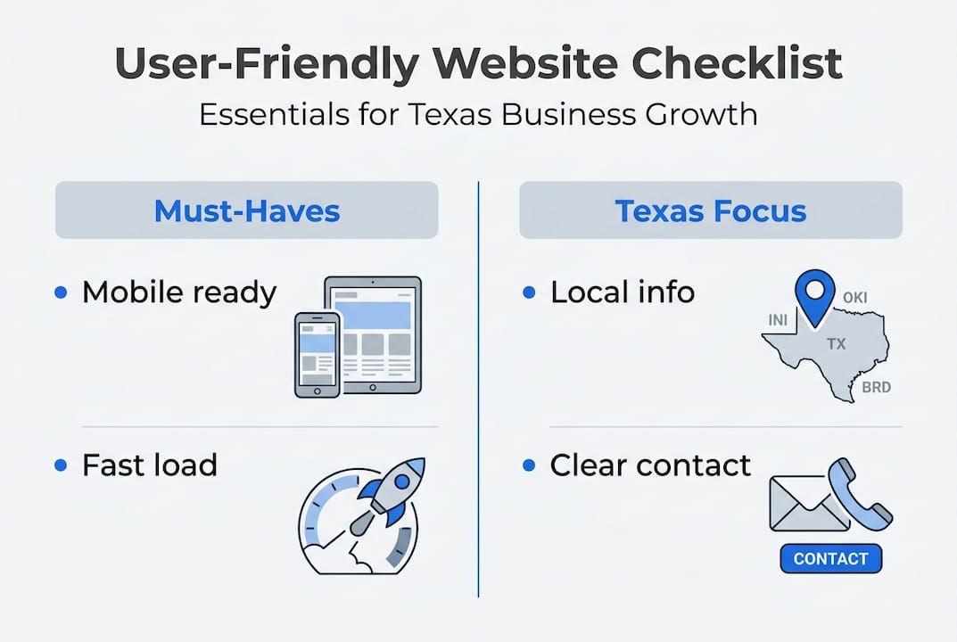
A user-friendly website is one that loads fast, works on any device, and lets visitors find what they need without confusion. It sounds simple. But many small business sites in Texas fall short on all three. And that gap costs real money.
First impressions happen fast. Users judge websites in milliseconds, and that snap judgment shapes whether they trust you or not. If your site looks cluttered, slow, or hard to read on a phone, visitors assume your business operates the same way. That is a credibility problem, not just a design problem.
For Texas small businesses, this matters even more. Your customers are comparing you to larger brands with polished, fast-loading websites. You do not need to match their budget. You do need to match their clarity. Why small business websites matter goes beyond just having a web address. Your site is often the first and only impression a potential customer gets.
"Prototypical designs improve attitudes and trust versus unusual layouts." This means sites that follow familiar patterns feel safer and more credible to visitors.
When your site is easy to use, the business results follow. Here is what improves when usability goes up:
- Lower bounce rates: Visitors stay longer and explore more pages
- More leads: Clear calls-to-action guide people to contact you or buy
- Better SEO rankings: Search engines reward fast, mobile-ready sites
- Fewer support requests: Customers find answers on their own
- Higher trust: Familiar layouts signal professionalism
Reviewing the website essentials for SMBs is a smart first step before making any changes. These fundamentals apply whether you run a plumbing company in San Antonio or a boutique in Austin.
Core features of a user-friendly website
Knowing the why is important. But you also need a clear picture of what to build or fix. Here are the core features every user-friendly small business website needs:
- Mobile-responsive design — Your site must look and work correctly on phones and tablets. Most Texas customers search on mobile.
- Fast load times — Pages should load in under three seconds. Slow sites lose visitors before they even see your content.
- Clear navigation — Menus should be simple, labeled clearly, and never more than two levels deep.
- Strong calls-to-action (CTAs) — Every page needs one clear next step: call now, get a quote, book online.
- Prototypical layout — Follow the standard patterns your industry uses. Mobile-first, fast-loading sites with familiar structures build trust faster.
- Accessibility basics — Use readable fonts, strong color contrast, and alt text on images.
| Feature | User-friendly site | Outdated site |
|---|---|---|
| Mobile display | Fully responsive | Broken or tiny text |
| Load speed | Under 3 seconds | 5 or more seconds |
| Navigation | Simple, clear labels | Confusing or buried menus |
| CTA placement | Visible on every page | Missing or unclear |
| Design style | Matches industry norms | Generic or dated look |
For Texas businesses, add one more item to this list: local clarity. Your site should show your city or service area, your phone number, and your hours on every page. Customers searching for "electrician near me" in Houston need to confirm you serve their area within seconds.
Pro Tip: Look at two or three competitor websites in your area. Notice what layout patterns they share. Matching those familiar patterns builds instant trust with shared customers. You can explore the Texas website design guide for region-specific guidance, and check affordable plans if you need a budget-friendly starting point. For a full breakdown of what to include, the modern features for SMBs resource covers current best practices.
Usability mistakes Texas small businesses should avoid
Even well-meaning business owners make website mistakes that quietly drain leads. Here are the most common ones:
- Cluttered pages with too much text, too many images, or competing messages
- Unclear menus that bury important pages like services, contact, or pricing
- Auto-playing videos or audio that startle visitors and cause them to leave immediately
- Slow loading caused by oversized images or cheap hosting
- Outdated design that signals neglect rather than professionalism
- Poor mobile experience where buttons are too small or text runs off-screen
The mobile issue is especially costly. Mobile web conversions are 2x lower when the user experience is poor. That means if your mobile site is hard to use, you could be losing half your potential customers before they ever contact you.

| Usability issue | Impact on users | Business cost |
|---|---|---|
| Slow load time | 53% leave after 3 seconds | Lost leads, lower SEO rank |
| Poor mobile layout | High bounce rate on phones | Up to 2x fewer conversions |
| No clear CTA | Visitors unsure what to do | Fewer inquiries and sales |
| Cluttered design | Cognitive overload | Shorter visit, less trust |
Pro Tip: Hand your phone to a real customer, someone who has never seen your site, and ask them to find your contact page or a specific service. Watch without helping. This one test catches most usability problems in under five minutes.
Affordable websites can still avoid all of these mistakes. Cost is not the barrier. Awareness is. Use the checklist of essentials to audit your current site. The mobile responsiveness workflow walks you through fixes step by step. And if you want a broader view, reviewing small business marketing mistakes shows how website issues connect to larger growth problems.
Balancing familiarity and innovation: The MAYA principle
User-friendly does not mean boring. It means smart. There is a design concept called the MAYA principle that explains this well.
"Most Advanced Yet Acceptable" — design should push forward, but never so far that it confuses or alienates the audience.
This principle comes from industrial design, but it applies directly to websites. The MAYA principle balances novelty and typicality for maximum appeal. In plain terms: your site can look fresh and modern, but it still needs to feel familiar enough that visitors know how to use it.
For Texas small businesses, this is a real risk. Some owners invest in highly creative or unusual designs to stand out. But when a site looks too different from what customers expect, trust drops. People hesitate. They are not sure where to click or whether the business is legitimate.
Here are smart ways to modernize your site without losing usability:
- Update your color palette with two or three fresh, on-brand colors while keeping standard button styles
- Use high-quality photos of your actual team, location, or products instead of generic stock images
- Add subtle animations on scroll, but avoid anything that distracts from the main message
- Incorporate AI-powered chat or booking tools that speed up the customer journey
- Refresh your typography with a clean, modern font that is still easy to read on small screens
Modern elements work best when they support the user's goal, not compete with it. Explore tips for modern Texas websites to see how other local businesses are making this balance work.
A Texas web expert's take: What most owners overlook
After working with small businesses across Texas, one pattern stands out clearly. Most owners spend too much time asking "does this look good?" and not enough time asking "can my customer find what they need in ten seconds?"
Style matters. But navigation and clarity win every time. A beautiful site with a confusing menu will always lose to a simple site with a clear path to contact or purchase.
The most overlooked step is pre-launch user testing. And in Texas, that means testing with bilingual users. A large share of Texas customers speak Spanish as their first language. If your site confuses them or lacks Spanish options, you are leaving a significant portion of your market behind.
We also see owners building sites around what they want to show, not what customers come to find. Flip that. Ask your best customers what they looked for when they first visited your site. Their answers will reshape your navigation instantly. Even AI tools cannot fix a site built around the wrong priorities. See how the client-focused design guide approaches this from the customer's point of view.
Affordable, expert-backed solutions for Texas small businesses
You now have a clear picture of what makes a website work and what holds one back. The next step is acting on it without overspending.
At Digital Biz Agent, we build websites for Texas small businesses starting at $50/month, with free demos so you see exactly what you are getting before you commit. Every site is mobile-responsive, SEO-ready, and built with the usability principles covered in this article. We also offer bilingual support in English and Spanish. Whether you need a full site or a focused landing page, understanding why websites are vital is the first step. Browse our website design services or review real examples to see what is possible for your business.
Frequently asked questions
What makes a website 'user-friendly' for small Texas businesses?
A user-friendly site is easy to navigate, loads quickly, works well on mobile, and clearly shows your local service area, contact details, and hours.
How can I update my outdated business website affordably?
Choose platforms or services that offer mobile-responsive templates and fast load speeds. AI tools built for SMBs can help, but always verify Core Web Vitals performance after launch.
Will a unique or unusual website design help my business stand out?
Not always. Atypical designs lower trust compared to familiar layouts. Use the MAYA principle to stay modern without confusing your visitors.
How does mobile usability affect sales and leads?
Poor mobile UX can cut your conversions in half compared to desktop, meaning you lose leads directly from a bad phone experience.