
Texas small businesses lose real revenue every year because their websites don't work properly on phones. Non-responsive sites lose $12B annually in sales across the U.S., and a big share of that belongs to local businesses that simply haven't updated their online presence. Most customers in Texas now browse on mobile first. If your site looks broken or loads slowly on a phone, they leave and find a competitor. This guide explains what responsive design is, how it directly affects your Google rankings, and what you can do right now to fix it affordably.
Table of Contents
- What is responsive design and why does it matter?
- SEO, visibility, and the mobile-first era
- Business impact: Conversions, sales, and Texas customer expectations
- Affordable paths for Texas small businesses: Solutions and tips
- Our perspective: What most guides miss about responsive design for Texas SMBs
- Next steps: Affordable, responsive web design for your Texas business
- Frequently asked questions
Key Takeaways
| Point | Details |
|---|---|
| Mobile-first is a must | Google ranks sites by mobile experience, so responsive design is essential for Texas businesses. |
| Boost SEO and sales | Responsive design increases rankings, conversions, and revenue for small businesses. |
| Easy, affordable solutions exist | Tools like WordPress and single-codebase sites make mobile optimization accessible and cost-effective. |
| Customers expect usability | A seamless mobile site builds trust and keeps local customers engaged. |
What is responsive design and why does it matter?
Responsive design is a web development approach that makes your website look and work correctly on any device, whether that's a desktop, a tablet, or a smartphone. The layout shifts, the images resize, and the text reflows automatically. You don't need a separate mobile site. One site handles everything.
Under the hood, responsive design uses fluid grids, flexible images, and CSS media queries to adapt layouts automatically to any screen size, and Google officially recommends it. CSS media queries are rules written into your site's code that tell the browser how to display content at different screen widths. Fluid grids mean your layout stretches or shrinks proportionally instead of staying fixed.
If you're new to some of these terms, this website design terminology guide breaks them down in plain language.
Here's a quick comparison of the three main design approaches:
| Design type | How it works | Best for | Cost |
|---|---|---|---|
| Responsive | One flexible layout for all screens | Most small businesses | Low |
| Adaptive | Fixed layouts for specific screen sizes | Performance-critical apps | Medium to high |
| Static | Fixed layout, no adjustment | Simple info pages | Very low |
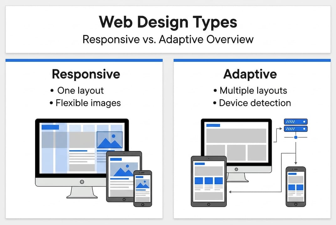
For most Texas small businesses, responsive is the right call. It's the most cost-effective and the most SEO-friendly option.
Why do customers expect it? Because they're used to it. Apps like Instagram, Google Maps, and banking tools all work perfectly on any screen. When a business website doesn't, it signals neglect. Customers associate a poor mobile experience with a poor business.
Here's what a responsive site does for your visitors:
- Text is readable without zooming
- Buttons are easy to tap on small screens
- Images load at the right size for the device
- Navigation menus collapse into mobile-friendly formats
- Forms and checkout flows work without horizontal scrolling
If you want to understand what separates a good site from a great one, this overview of professional web design is worth reading before you make any decisions.
SEO, visibility, and the mobile-first era
Understanding the mechanics of responsive design sets the stage for its biggest impact: how it can make or break your business's SEO and online visibility.
Google's mobile-first indexing crawls and ranks sites using the mobile version exclusively, making responsive design essential for SEO visibility. This means Google doesn't care how your site looks on a desktop anymore. It looks at the mobile version first. If your mobile site is missing content, loads slowly, or is hard to navigate, your rankings drop.
Here's what the data shows for responsive versus non-responsive small business websites:
| Metric | Responsive site | Non-responsive site |
|---|---|---|
| Organic traffic | Up 25% on average | Flat or declining |
| Bounce rate | 25-50% lower | High |
| Conversion rate | 15-40% higher | Low |
| Google ranking potential | Strong | Weak |
Responsive sites boost conversions by 15-40%, reduce bounce rates by 25-50%, and increase organic traffic by 25%. Those aren't small numbers for a local business trying to grow.
A high bounce rate tells Google your site isn't giving users what they need. That signal alone can push you down in search results, even if your content is good.
Common SEO problems caused by non-responsive sites include:
- Duplicate content issues when running separate mobile and desktop URLs
- Slow load times from unoptimized images and code
- Poor Core Web Vitals scores, which Google uses as a ranking factor
- Missing or broken elements on mobile that exist on desktop
- Low time-on-site metrics because users leave quickly
You can review the full list of modern website features that support SEO and user experience together. If you want a step-by-step review of your current site, this mobile-responsive checklist walks you through every key area. And if you're still weighing whether a website is even worth the investment, this breakdown of why SMB websites matter makes the case clearly.
Business impact: Conversions, sales, and Texas customer expectations
Improved SEO brings more visitors, but what really matters for small businesses is converting those visitors into customers. Let's see how responsive design drives real business results in Texas.

Responsive sites boost conversions by 15-40% and non-responsive sites lose $12B annually in sales. For a small business doing $200,000 a year in revenue, a 15% conversion lift isn't abstract. That's $30,000 in additional sales from the same traffic.
Texas customers are practical. They search for a plumber, a restaurant, or a boutique on their phone while they're already out. If your site doesn't load fast or looks broken, they call someone else. It's that simple. Mobile usability is now a trust signal, not a bonus feature.
Here's what responsive design solves for your customers directly:
- Slow load times on mobile are eliminated with properly sized images and clean code
- Unreadable text that requires zooming is replaced with auto-scaling fonts
- Broken layouts where buttons overlap or menus disappear are fixed
- Hard-to-fill forms that require horizontal scrolling are replaced with mobile-optimized inputs
- Frustrating checkout experiences that cause cart abandonment are streamlined
There's also a cost angle that most business owners overlook. Running two separate sites, one for desktop and one for mobile, doubles your maintenance work and your hosting costs. A single responsive site means one set of updates, one place to manage content, and one SEO strategy.
Pro Tip: A single responsive site cuts your ongoing maintenance time and cost significantly. Every update you make applies across all devices at once. No syncing, no duplicate work, no risk of the two versions getting out of sync.
For a full breakdown of what your site needs to perform well, check out these website essentials for SMBs.
Affordable paths for Texas small businesses: Solutions and tips
You know the benefits. Here's how small businesses in Texas can affordably put responsive design into action.
Using WordPress with responsive themes means a single codebase cuts costs 35% compared to running separate desktop and mobile sites. WordPress powers over 40% of all websites globally, and most modern themes are built responsive by default. You don't need to start from scratch or hire an expensive agency to get a mobile-ready site.
For most Texas SMBs, responsive outperforms adaptive: easier maintenance, better SEO with a single URL, and more scalability. Adaptive design can be useful for very specific performance needs, but it costs more to build and maintain. Unless you're running a complex web app, responsive is the smarter choice.
To pass Google's Core Web Vitals and avoid layout shifts, implement viewport meta tags, srcset images, lazy loading, and explicit dimensions. These are technical steps, but many of them are handled automatically by good themes and plugins.
Here are the key steps to make sure your site is responsive:
- Add a viewport meta tag to your site's HTML header so browsers know to scale the layout
- Use a responsive WordPress theme or a page builder that handles mobile layouts automatically
- Replace fixed-width images with flexible ones using CSS max-width settings
- Enable lazy loading so images only load when a user scrolls to them
- Test your site on real devices, not just a browser resize tool
- Run Google's free Mobile-Friendly Test to identify specific issues
- Check your Core Web Vitals score in Google Search Console regularly
Pro Tip: Stick to a single codebase. Avoid the temptation to build a separate mobile site. One responsive site is easier to update, cheaper to host, and performs better in search.
For a deeper look at how all of these pieces fit together, this website design guide is a solid starting point.
Our perspective: What most guides miss about responsive design for Texas SMBs
Most articles about responsive design focus on code and technical specs. That's useful, but it misses the real point for small business owners in Texas.
Responsive design isn't just about fitting your site onto a smaller screen. It's about earning trust. When a customer lands on your site from their phone and everything works, they don't think about it. That's the goal. The experience is invisible, and that invisibility is what builds confidence in your business.
The businesses that struggle aren't usually ignoring mobile on purpose. They're overwhelmed by options or convinced they need something complex and expensive. They don't. A clean, fast, single-codebase responsive site built on a solid platform will outperform an over-engineered custom build almost every time.
Simple, focused solutions win. A well-chosen responsive theme, good content, and proper technical setup will get you further than a flashy site that loads slowly on a phone. Understanding what a web development agency does can help you ask better questions and avoid overpaying for things you don't need.
The bar in Texas isn't that high yet. Most small business sites are still behind. That's your opportunity.
Next steps: Affordable, responsive web design for your Texas business
Armed with practical know-how and a fresh perspective, here's how to make responsive design a reality for your business.
At Digital Biz Agent, we build mobile-ready, SEO-optimized websites for Texas small businesses starting at $50/month. No large upfront costs, no confusing process. We handle the design, the launch, and the ongoing support so you can focus on running your business.

Our affordable web design services are built specifically for small businesses that need results without the agency price tag. Check out our website pricing plans to find the right fit. If you're still on the fence, this list of why websites are vital for small businesses makes the decision easier. We offer a free demo so you can see your new site before you commit to anything.
Frequently asked questions
What's the difference between responsive and adaptive design?
Responsive design automatically adjusts to any device using flexible elements, while adaptive design uses fixed layouts for specific screen sizes. For most small businesses, responsive is easier to maintain and better for SEO.
How does responsive design affect SEO on Google?
Google prioritizes the mobile version of your site for ranking, so a responsive site is critical for better visibility and organic traffic. A non-responsive site can hurt your rankings even if your content is strong.
How can I make my small business website responsive affordably?
Use platforms like WordPress with mobile-ready themes, and a single codebase cuts costs 35% compared to separate desktop and mobile sites. Following basic best practices like viewport meta tags and flexible images keeps costs low.
Are there common mistakes Texas small businesses make with responsive design?
Yes. Common mistakes include neglecting mobile navigation menus, using fixed-width images that break on small screens, and skipping testing on actual phones and tablets.
How often should a small business update its website design?
Most experts recommend reviewing your design every 2-3 years or after major Google algorithm updates to stay current with both user expectations and search requirements.