
TL;DR:
- Mobile optimization improves speed, usability, and local info visibility to attract and retain customers.
- Focusing on fast load times and clear contact options increases search rankings and conversion rates.
- Most fixes are low-cost, like compressing images and simplifying navigation, boosting small business growth.
A potential customer finds your business on Google, taps your link, and waits. The page loads slowly, the text is tiny, and the phone number is buried somewhere they can't find. They leave. That visit cost you nothing to get and everything to lose. For Texas small businesses competing in crowded local markets, that scenario plays out dozens of times a day. This guide breaks down exactly what mobile optimization means, why it matters for your bottom line, and how to fix the most common problems without spending a fortune.
Table of Contents
- What is mobile optimization? Demystifying the basics
- Why does mobile optimization matter for Texas small businesses?
- The technical side: Performance and Core Web Vitals
- Affordable mobile optimization strategies for small businesses
- A Texas web expert's take: What most business owners miss about mobile optimization
- Your next step to a mobile-optimized, business-winning website
- Frequently asked questions
Key Takeaways
| Point | Details |
|---|---|
| Mobile optimization definition | It means making your website fast, easy to use, and action-ready on phones and tablets. |
| Impact on Texas businesses | A mobile-optimized site helps attract and convert local customers searching on their devices. |
| Technical essentials | Focus on performance metrics like Core Web Vitals and practical steps like image compression for real gains. |
| Affordable strategies | Small changes like better navigation and simple layouts can significantly boost mobile results without high costs. |
| Next steps | Review your site, prioritize basics, and consider expert help to maximize your mobile opportunity. |
What is mobile optimization? Demystifying the basics
A lot of business owners assume that because their website shows up on a phone, it must be working fine. That is not the case. Mobile optimization is the practice of making your website work well on phones and tablets, covering speed, usability, and correct rendering, so mobile visitors can quickly find information and take action. A site that simply scales down your desktop layout is not optimized. It is just squeezed.
Think about the difference between a restaurant that seats you at a full-size table and one that crams a full-size table into a closet. Both technically seat you. Only one is a good experience.
Here is a quick comparison of what each version of a site looks like in practice:
| Feature | Desktop site on mobile | Unoptimized mobile site | Fully optimized mobile site |
|---|---|---|---|
| Text size | Too small to read | Inconsistent | Readable without zooming |
| Navigation | Tiny links, hard to tap | Cluttered menus | Simple, thumb-friendly menu |
| Load speed | Often slow | Slow to moderate | Fast (under 3 seconds) |
| Contact button | Hard to find | Present but small | Prominent tap-to-call button |
| Images | Oversized, slow loading | Not resized for mobile | Compressed and fast |
| Local info | Buried in footer | Inconsistent placement | Visible on first scroll |
A fully optimized mobile site is built with the phone user in mind from the start. It is not an afterthought. Check out this website design guide for a deeper look at what a well-built small business site should include.
Key elements of a mobile-optimized site include:
- Fast load time. Pages should load in under 3 seconds on a standard mobile connection.
- Large, tappable buttons. Fingers are not as precise as a mouse cursor. Buttons need to be big enough to tap without frustration.
- Readable text. No pinching or zooming required. Font size should be at least 16px for body text.
- Simple navigation. One clear menu. No dropdown layers. Users should find what they need in two taps or fewer.
- Compressed images. Large image files are the single most common cause of slow mobile load times.
- Visible contact info. Phone number, address, and hours should be easy to find without scrolling deep into the page.
Why does mobile optimization matter for Texas small businesses?
Now that you know what mobile optimization actually means, here is why it directly affects your revenue and your ability to compete locally.
More than half of all local website visits start on a mobile device. That number is even higher for searches that include terms like "near me" or specific city names like "plumber in Lubbock" or "tacos in San Antonio." When someone is out and about and searching for a business like yours, they are almost certainly on their phone.
Google's mobile guidance is clear: mobile site design should focus on simple navigation, fast page loading, and making it easy to take action. Simply seeing your desktop site on mobile does not mean it is mobile-friendly. Google uses this standard when deciding where to rank your site in local search results.
Here is what happens when your site is not optimized:
- Visitors leave faster. A slow or confusing mobile site increases your bounce rate, which means users click away before taking any action.
- You rank lower. Google's algorithm prioritizes mobile performance, especially for local searches.
- You lose calls and walk-ins. If a user cannot tap to call or find your address quickly, they move on to a competitor who makes it easy.
- You lose trust. A site that looks broken on a phone signals that your business may not be current or professional.
Understanding mobile-first design principles can help you see how to build or rebuild your site with phone users as the priority, not an afterthought.
Pro Tip: Add clearly visible "Call Now," "Get Directions," and "Hours" buttons near the top of your mobile homepage. These are the three things most local customers want immediately. Make them impossible to miss.
Following a responsive design workflow and using a mobile optimization checklist are two practical ways to make sure nothing gets missed when you update or launch a site.
The technical side: Performance and Core Web Vitals
Mobile optimization is not just about how your site looks. It is also about how it performs under the hood. Google measures this through a set of metrics called Core Web Vitals. These are real, measurable scores that affect your rankings and your user experience.
Here are the three Core Web Vitals you need to know:
| Metric | What it measures | Good score |
|---|---|---|
| LCP (Largest Contentful Paint) | How fast the main content loads | Under 2.5 seconds |
| INP (Interaction to Next Paint) | How quickly the page responds to taps | Under 200 milliseconds |
| CLS (Cumulative Layout Shift) | How stable the page is while loading | Under 0.1 |
Mobile optimization includes technical performance improvements measured by Core Web Vitals (LCP, INP, CLS), and real-world data shows fewer sites pass these metrics on mobile than on desktop. That gap matters. If your competitors are failing these tests too, fixing them gives you a direct ranking advantage.
Mobile devices face harder conditions than desktops. Slower processors, variable network speeds, and smaller memory all make performance harder to achieve. That is why a site that feels fast on a laptop can still feel sluggish on a phone.
Here is how to improve your Core Web Vitals step by step:
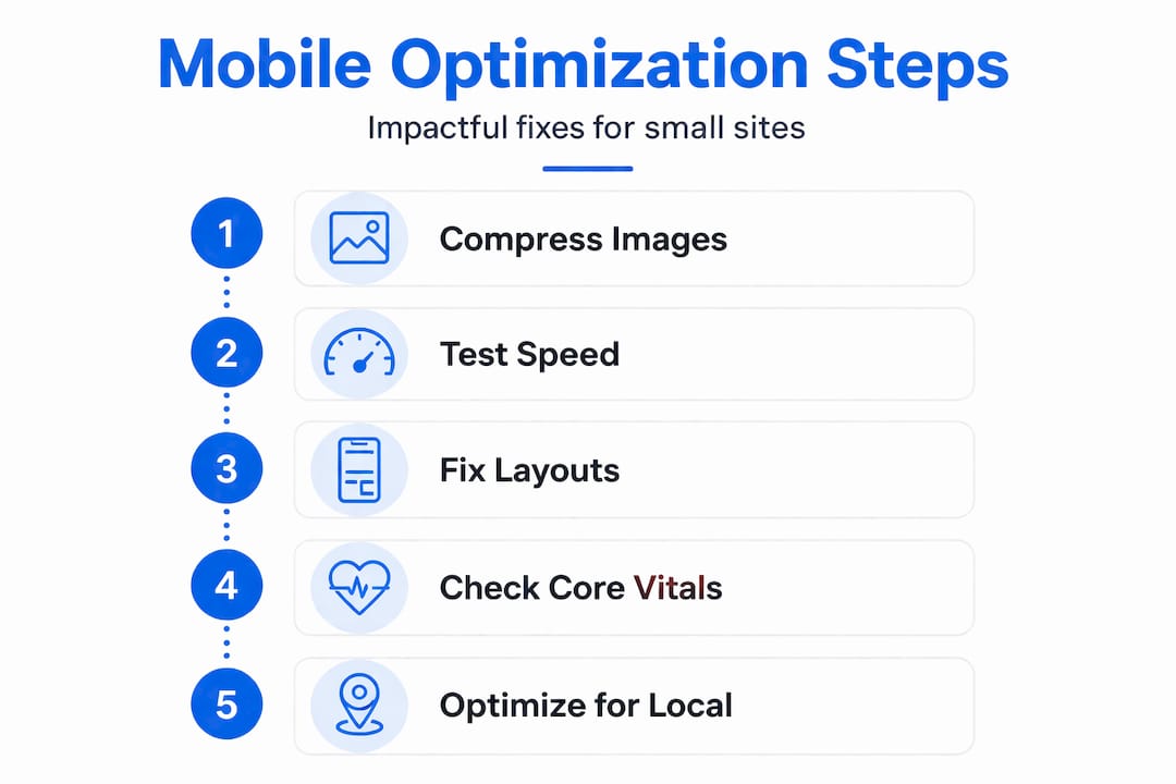
- Compress your images. Use tools like TinyPNG or Squoosh to reduce file sizes without losing visible quality. This is the fastest win for LCP.
- Use a reliable hosting provider. Slow servers add seconds to your load time before a single image even appears.
- Minimize layout shifts. Reserve space for images and ads in your code so the page does not jump around while loading.
- Reduce plugins and scripts. Every extra plugin adds load time. Audit what is actually needed and remove the rest.
- Enable browser caching. This allows returning visitors to load your site faster because their browser stores parts of it locally.
- Use a content delivery network (CDN). A CDN serves your site from servers closer to your visitor, cutting load time.
Pro Tip: Before you touch fonts, colors, or any visual design element, fix your images and layout stability first. These two issues account for the majority of mobile performance failures and are the most straightforward to address.
Reviewing modern website features for SMBs and understanding responsive web development will help you see which technical upgrades give you the best return for your investment.
Affordable mobile optimization strategies for small businesses
You do not need a big agency budget to make meaningful improvements. Most of the highest-impact changes are free or low-cost. The key is knowing where to focus first.

Real-world performance data shows that mobile Core Web Vitals are harder to pass than desktop. For affordable websites, this means prioritizing image and layout stability work (LCP and CLS) and interactive responsiveness (INP) before anything else.
Start with these practical steps:
- Compress every image on your site. Use free tools like Squoosh or the Smush plugin for WordPress. This alone can cut load time by 30 to 50 percent.
- Simplify your navigation menu. Limit top-level menu items to five or fewer. Remove anything that is not essential for a first-time visitor.
- Use large tap targets. Buttons and links should be at least 44 pixels tall and wide. If users have to zoom in to tap something, it is too small.
- Remove unused plugins. Each plugin adds weight. Audit your site and delete anything you are not actively using.
- Make contact info visible without scrolling. Your phone number and address should appear in the header or within the first screen of content on mobile.
- Test on real devices. Open your site on an Android phone and an iPhone. What you see may surprise you.
"Navigation should be streamlined and key local actions should be easy on small screens." This is Google's core guidance for mobile site design, and it applies directly to Texas small businesses trying to convert local searchers into paying customers.
Affordable tools worth using include Google PageSpeed Insights (free), Google Search Console (free), TinyPNG for image compression (free), and WP Rocket or LiteSpeed Cache for WordPress sites (low cost). These tools give you clear, actionable data without requiring a developer.
Explore these affordable mobile optimization steps for a practical checklist you can work through on your own. And if you want to see what a well-optimized site looks like visually, check out these modern design trends that are working for small businesses right now.
The bottom line: most small business sites have three to five quick wins available that cost nothing but time. Fix those first. Then decide if you need professional help for the rest.
A Texas web expert's take: What most business owners miss about mobile optimization
Here is something we see constantly working with Texas small businesses. Owners spend hours picking fonts, debating logo placement, and requesting color changes. Then they launch a site that takes six seconds to load on a phone and buries the phone number at the bottom of the page. The design looks great on a desktop. On mobile, it loses customers every single day.
The real barrier to mobile optimization is not cost. It is awareness. Most business owners do not realize that a slow, hard-to-navigate mobile site is actively costing them customers right now. They cannot see the people who bounced. They only see the calls they did get, not the ones they never received.
What actually drives results for local Texas businesses is not a flashy homepage video or an animated logo. It is consistent, accurate local information, a fast load time, and a clear path to contact you. That is it. A customer searching for an HVAC company in Abilene or a bakery in El Paso does not care about your site's design awards. They want to know if you are open and how to reach you.
We have seen simple sites with clean mobile layouts outperform expensive, feature-heavy sites in local search results. The reason is straightforward: Google rewards usability and speed, and users reward clarity. Both of those things favor simple, well-optimized sites over complex, slow ones.
Understanding how responsive design for SEO connects to actual sales outcomes can shift how you think about your site. It is not just a marketing tool. It is a revenue tool.
Pro Tip: Pull out your phone right now and open your own website as if you are a first-time visitor. Try to find your hours, your address, and your phone number in under 10 seconds. If you cannot do it, your customers cannot either.
Your next step to a mobile-optimized, business-winning website
A mobile-optimized site is not optional for Texas small businesses in 2026. It is the baseline for attracting local customers and staying competitive. If your site is slow, hard to navigate on a phone, or missing key local information, you are losing business to competitors who have already fixed these issues.

Start by reviewing the website essentials for small businesses to make sure your site covers the fundamentals. Then, when you are ready for professional support, Digital Biz Agent offers website design and SEO services built specifically for small businesses, with affordable pricing starting at $50 per month and a free demo so you can see results before you commit. If you are still on the fence about whether a website is worth it, read through the website importance for small businesses and see exactly what a well-built site can do for your growth. We are based in Lubbock and work with businesses across Texas. Reach out and let us show you what your site could look like.
Frequently asked questions
What is the difference between mobile optimization and mobile responsiveness?
Mobile responsiveness means your site layout adjusts to fit smaller screens, while mobile optimization goes further by ensuring fast speed, strong usability, and easy local actions for phone users. Responsiveness is one part of optimization, not the whole picture.
Why are Core Web Vitals important for my small business website?
Core Web Vitals measure real-world mobile performance across speed, interactivity, and visual stability, and Google uses these scores as ranking signals. Poor scores mean lower rankings and fewer customers finding your site.
How can I check if my site is mobile-optimized?
Use Google's free PageSpeed Insights or Mobile-Friendly Test tool to get a score and a list of specific issues to fix. Both tools are free and require no technical knowledge to use.
Is mobile optimization expensive for small, local businesses?
Most of the highest-impact fixes are free or very low cost. Prioritizing image compression and layout stability work first means you can see real improvements without hiring a developer or spending a large budget.
Does mobile optimization really help attract more local customers?
Yes. Google's mobile guidance emphasizes that streamlined navigation and easy local actions on small screens directly improve how often nearby customers contact and visit your business. A faster, clearer site converts more visitors into customers.