
TL;DR:
- Mobile accounts for over 60% of global website traffic, making responsiveness essential.
- Building for mobile-first ensures layouts adapt smoothly across all device sizes.
- Testing on various devices and fixing common issues improves user experience and boosts conversions.
Mobile accounts for over 60% of global website traffic, and Texas customers are no different. If your site looks broken on a phone, visitors leave fast and rarely come back. That lost click is a lost sale. This step-by-step tutorial walks you through exactly what you need to build or fix a mobile-responsive website, from gathering your tools to testing your final result. No jargon, no guesswork. Whether you handle it yourself or work with a pro, you will know what to do, what to expect, and how to keep costs low while moving quickly.
Table of Contents
- What you need to get started
- Plan your mobile-first layout
- Build your site: Core steps for mobile responsiveness
- Test, troubleshoot, and launch your site
- Why fast, flexible mobile websites are a Texas business superpower
- Upgrade your online presence faster—with expert support
- Frequently asked questions
Key Takeaways
| Point | Details |
|---|---|
| Mobile-first is essential | Designing for small screens first ensures your site works for the majority of visitors. |
| Testing prevents costly mistakes | Trying your site on actual mobile devices helps you catch and fix problems before customers do. |
| Fast fixes boost your bottom line | Improving mobile responsiveness can increase leads and sales without a full website overhaul. |
| Tools make it easier | Modern website builders and templates offer affordable, code-free ways to become mobile-ready. |
What you need to get started
A mobile-responsive website is one that automatically adjusts its layout and content to fit any screen size, whether that is a phone, tablet, or desktop. The site does not just shrink. It reorganizes. Text stacks, menus collapse, and images resize so everything stays readable and clickable.
Before you build anything, gather your materials. Here is what you need:
- Business logo in a high-resolution file (PNG or SVG preferred)
- Color palette with your brand colors (hex codes if you have them)
- Photos of your business, team, products, or services
- Page list such as Home, About, Services, Contact
- Domain name and hosting account, or access to a website builder
You do not need to know how to code. Most modern builders handle the technical side for you. That said, if you want more control, responsive layouts are built with CSS media queries, Flexbox, and Grid. These are the tools that tell your site how to behave on different screen sizes.
Here is a quick comparison of popular platforms to help you choose:
| Platform | Cost | Ease of use | Bilingual support | Coding needed |
|---|---|---|---|---|
| Wix | $17+/month | Very easy | Limited | No |
| WordPress | $4+/month | Moderate | Strong (plugins) | Optional |
| Squarespace | $16+/month | Easy | Moderate | No |
| Custom HTML/CSS | Varies | Advanced | Full control | Yes |
For a deeper look at how to structure your build process, the responsive design workflow guide covers each phase clearly. You can also review the full website design guide for Texas businesses if you want broader context before you start.
Pro Tip: If you serve Texas's large Spanish-speaking population, look for templates that support bilingual content from the start. Switching languages after launch is harder and more expensive.
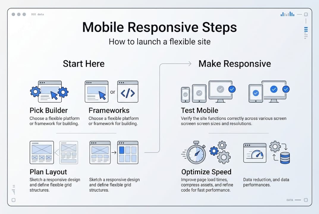
Plan your mobile-first layout
Mobile-first design means you build for the smallest screen first, then scale up for tablets and desktops. This is not just a trend. It is the smarter approach because most of your visitors are already on phones.
Mobile-first starts with base styles for small screens and uses min-width media queries for larger viewports. In plain terms: you design the simple version first, then add complexity as the screen gets bigger.
Follow these steps to plan your layout:
- Sketch a single-column layout. On mobile, content stacks vertically. Start with one column for all sections.
- Group your navigation. Use a hamburger menu (three stacked lines) or large tap-friendly buttons. Avoid long horizontal nav bars.
- Identify must-have info. What does a mobile visitor need in the first five seconds? Usually: what you do, where you are, and how to contact you.
- Add the viewport meta tag. This small line of HTML code tells browsers to scale your site correctly. Without it, your site will look tiny on phones.
- Plan for tablets and desktops. Once mobile is solid, decide where you want two or three columns to appear on larger screens.
Here is how single-column and multi-column layouts compare:
| Feature | Single-column (mobile) | Multi-column (desktop) |
|---|---|---|
| Reading flow | Linear, easy to scan | Side-by-side content |
| Navigation | Collapsed menu | Full horizontal nav |
| Images | Full-width, stacked | Grid or float layout |
| Best for | Phones under 480px | Screens above 768px |
For more detail on mobile-first design principles and how they affect engagement, that resource is worth a read. When you are ready to decide on structure, the guide on choosing your website layout breaks down which formats work best for different business types.
Pro Tip: Place your phone number, address, and main call-to-action button near the top of your mobile page. Visitors should not have to scroll to find how to reach you.
Build your site: Core steps for mobile responsiveness
Now you build. Whether you use a website builder or write code yourself, the core steps are the same.
Mobile responsive websites use CSS media queries, Flexbox, and Grid for flexible layouts that adapt to different screen sizes. And use the viewport meta tag for proper scaling. That tag looks like this in your HTML head section:
"<meta name="viewport" content="width=device-width, initial-scale=1.0">`
Here are the core build steps:
- Choose a responsive template or start with a blank responsive framework.
- Add the viewport meta tag if it is not already included.
- Apply media queries to adjust layout at breakpoints. Example:
@media (min-width: 768px) { .container { display: flex; } } - Style your navigation so it collapses on small screens and expands on larger ones.
- Resize and compress images so they load fast. Large images are the number one cause of slow mobile pages.
- Test responsiveness using your builder's mobile preview or Chrome DevTools.
Only 42 to 48% of mobile pages meet all Core Web Vitals benchmarks. Most fail because of slow images and poor layout choices. That is a real opportunity for your business to stand out.

Pro Tip: Use the srcset attribute on images to load the right file size for each device. This can improve page load speed by up to 60%, which directly affects how long visitors stay on your site.
For a full checklist, the Texas responsive website checklist covers every item before launch. You can also see how responsive design for SEO connects directly to more sales.
Test, troubleshoot, and launch your site
Building is only half the job. Testing is where most people skip steps and pay for it later with lost customers.
Run these checks before you go live:
- Open your site on your own phone
- View it in Chrome, Safari, and Firefox
- Resize your browser window from wide to narrow and watch how the layout responds
- Check every page for hidden or cut-off content
- Tap every button and link to confirm they work on touchscreens
Common problems to look for:
- Menu not visible on small screens
- Images too large and pushing content off screen
- Buttons too small to tap accurately
- Text overlapping other elements
- Forms not usable on mobile keyboards
"The most overlooked mobile issue is navigation collapse. Site menus that disappear on small screens leave visitors with no way to move around your site."
Edge cases include foldables, feature phones, browser inconsistencies, and fixed pixels that cause scaling issues. These are easy to miss if you only test on one device.
Use container queries, clamp for fluid typography, and aspect-ratio to prevent layout shifts. These are modern CSS tools that keep your design stable across all screen sizes.
Chrome DevTools lets you simulate dozens of phone models right from your desktop browser. Test on a friend's device too. A second set of eyes on a different phone catches issues you will miss on your own.
For more steps after launch, the website optimization steps guide covers ongoing improvements. You can also review a list of modern website features to see what else your site might need.
Why fast, flexible mobile websites are a Texas business superpower
Here is an honest take: a lot of Texas small business owners still believe a basic site is good enough. It has a phone number, a few photos, and an address. Done. That thinking costs real money.
When a customer in San Antonio or El Paso searches for a local plumber, roofer, or restaurant on their phone, they tap the first result that loads fast and looks clean. If your site takes four seconds to load or shows a broken menu, they tap back and call your competitor. That happens dozens of times a day.
Mobile performance connects directly to trust. A fast, clean site signals that your business is professional and reliable. In diverse Texas communities where word-of-mouth and referrals drive growth, that first impression online carries the same weight as a handshake.
We have seen businesses go from zero online leads to consistent weekly inquiries just by fixing their mobile layout and load time. No new ads. No new content. Just a site that works on a phone.
The other thing worth saying: a solid mobile foundation gives you room to grow. When you are ready to add online booking, a Spanish-language version, or a product catalog, the structure is already there. You can learn more about what that foundation should include through website essentials for Texas businesses.
Upgrade your online presence faster—with expert support
If this tutorial gave you a clear picture of what needs to happen but you want someone to handle it for you, that is exactly what we do at Digital Biz Agent.

We build affordable, mobile-responsive websites for Texas small businesses, with bilingual support in English and Spanish, fast turnaround, and plans starting at $50/month. You get a professional site without the agency price tag. Explore our Texas web design & SEO services to see what is included, check the full list of 8 essential website features every business site needs, or review our simple website pricing to find the right plan. We offer a free demo so you can see your site before you commit.
Frequently asked questions
What is a mobile responsive website?
A mobile responsive website automatically adjusts its design and layout to display well on any device, from phones to desktops. Mobile responsive websites use CSS media queries, Flexbox, and Grid for flexible layouts.
What are Core Web Vitals, and why do they matter?
Core Web Vitals are speed and usability metrics that Google uses to rank your site. Only 42 to 48% of mobile pages pass all benchmarks, so improving yours puts you ahead of most competitors.
Can I build a mobile responsive website without coding?
Yes. Many website builders offer built-in mobile responsive templates that require no coding at all. Wix, Squarespace, and WordPress all have drag-and-drop options.
How can I test if my website is mobile responsive?
Open your site on your phone and use Chrome DevTools to simulate different screen sizes. Testing on multiple devices and browsers catches the most common mobile design errors.
What are common mobile responsive design mistakes?
The most frequent issues are menus that disappear, oversized images, tiny buttons, and overlapping text. Navigation collapse and fixed pixels are common problems that container queries and fluid typography can fix.