
TL;DR:
- Mobile responsiveness ensures websites adapt to all screen sizes for better user experience.
- Non-responsive sites lose potential customers, load slower, and rank lower on Google.
- Small fixes like improved navigation and optimized images can significantly boost performance.
Most small business owners assume their website looks fine on every device. It probably looks great on your desktop. But pull it up on a phone, and you might see tiny text, broken layouts, and buttons that are impossible to tap. That is the moment a potential customer leaves and never comes back. 72% of users abandon non-responsive mobile sites. If your site is not built to adapt, you are quietly losing business every single day. This guide breaks down what mobile responsiveness actually means, why it matters for your Lubbock business, and what you can do about it right now.
Table of Contents
- Defining mobile responsiveness: What it really means
- Why mobile responsiveness matters for business growth
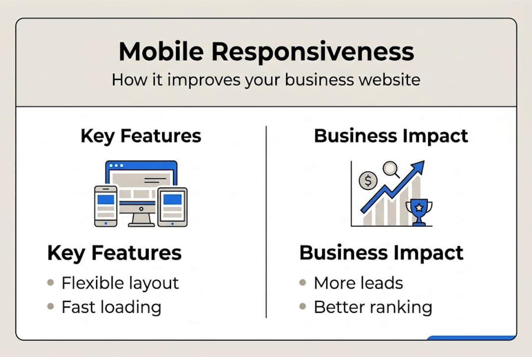
- How mobile responsiveness works: Key features and techniques
- Getting started: Practical steps for Lubbock small businesses
- Our perspective: What most business owners miss about mobile responsiveness
- Upgrade your website: Affordable solutions for Lubbock businesses
- Frequently asked questions
Key Takeaways
| Point | Details |
|---|---|
| Mobile traffic is dominant | Most web visitors in 2026 use phones or tablets, so mobile responsiveness is essential for growth. |
| Responsive design boosts results | Sites that adapt to all devices load faster, convert more visitors, and lower bounce rates. |
| Affordable for small businesses | You can achieve modern, mobile-friendly sites with one codebase and avoid unnecessary costs. |
| Start small, review often | Simple updates and regular checkups keep your site effective without major overhauls. |
Defining mobile responsiveness: What it really means
The term gets thrown around a lot, but most people do not know what it actually describes. Mobile responsiveness is a web design method where a site adapts its layout and content to fit any screen size, whether that is a phone, tablet, laptop, or desktop monitor. One website. Every device. No exceptions.
This is not the same as building a separate mobile site. A separate mobile site means you manage two versions of your content, two sets of updates, and two chances for something to break. A responsive site is a single, flexible build that adjusts automatically based on the screen it is being viewed on.
Here is how it works under the hood, in plain terms:
- Fluid grids: Page columns and sections are sized in percentages, not fixed pixels. So they shrink or expand based on screen width.
- Flexible images: Photos and graphics scale within their containers. They do not overflow or get cut off on small screens.
- CSS media queries: These are rules written into the site's code that say, "If the screen is smaller than X pixels, apply this layout instead."
- The viewport meta tag: This tells the browser how to scale the page correctly when it first loads on a mobile device.
All four of these elements work together. Remove one, and the experience starts to break. A site with fluid grids but no media queries might still show desktop navigation on a phone. A site with media queries but no flexible images might load oversized photos that push content off-screen.
For a deeper look at how this fits into a real build process, the responsive design workflow we use for Texas small businesses walks through each stage clearly.
"Responsive design is no longer a feature. It is the baseline expectation. Users do not reward sites that work on mobile. They punish sites that do not." — Web design industry standard, 2026
The takeaway here is simple. Mobile responsiveness is not a bonus feature you add later. It is the foundation of any modern website that is meant to attract and keep customers.
Why mobile responsiveness matters for business growth
Understanding the definition is one thing. Seeing the business impact is another. Let us look at the numbers.
Mobile traffic now represents 55 to 64% of all web visits globally. That means more than half of the people visiting your website right now are on a phone or tablet. If your site does not work well on those devices, you are turning away the majority of your potential customers before they even read your first sentence.
The performance gap between responsive and non-responsive sites is significant. Responsive sites load faster, keep visitors engaged longer, and convert at higher rates. Here is a quick snapshot:

| Metric | Non-responsive site | Responsive site |
|---|---|---|
| Page load speed | Slower, unoptimized | Up to 20% faster |
| Bounce rate | Higher abandonment | Reduced by up to 25% |
| Conversion rate | Lower engagement | Up to 67% higher |
| Maintenance effort | Two versions to update | One codebase only |
Those numbers are not just statistics. They translate directly into leads, calls, and sales for your business. Check the mobile visitor statistics for a clearer picture of how this plays out for small businesses specifically.
Beyond the numbers, there is a trust factor. When someone lands on a site that looks broken or is hard to navigate on their phone, they do not think "this site has a technical issue." They think "this business is not professional." That perception is hard to undo.
The good news is that the responsive development benefits go beyond just looking good. You also get better Google rankings, lower ad costs, and a smoother experience for repeat visitors.
Pro Tip: A responsive site means you only manage one website instead of two. That saves you time and money every month, especially if you are updating content, running promotions, or adding new services.
How mobile responsiveness works: Key features and techniques
Now let us get into how a responsive site actually comes together. You do not need to know how to code. But understanding the pieces helps you ask the right questions when working with a web professional.
The core mechanics include the viewport meta tag, fluid grids, media queries, relative units, and responsive images. Here is how they work together when someone visits your site on a phone:
- The browser reads the viewport tag. This tells the phone how wide to treat the page. Without it, phones often zoom out and show a tiny desktop version.
- The fluid grid kicks in. Instead of a fixed three-column layout, the grid collapses to a single column that fits the phone screen.
- Media queries apply phone-specific styles. Font sizes increase for readability. Navigation turns into a tap-friendly menu. Buttons get larger.
- Images resize within their containers. A photo that is 1200 pixels wide on desktop shrinks proportionally so it does not overflow on a 375-pixel phone screen.
- The page loads fast and clean. The visitor sees a layout built for their device, not a shrunken desktop version.
Here is a direct comparison of what the experience looks like on each type of site:
| Feature | Responsive site | Non-responsive site |
|---|---|---|
| Device compatibility | All screen sizes | Desktop only |
| Update workload | One update, all devices | Separate updates needed |
| User experience | Smooth and intuitive | Zooming, scrolling sideways |
| SEO performance | Google-preferred | Penalized in rankings |
For more context on how this fits into a full website build, the Texas web design guide covers what small businesses need to know before starting. And if you want to audit your current site, the responsive website checklist gives you a step-by-step review process.
Getting started: Practical steps for Lubbock small businesses
Knowing what mobile responsiveness is and actually improving your site are two different things. Here is how to move from awareness to action.
Step one: Test your current site. Use free tools to see where you stand right now:
- Google Mobile-Friendly Test (search.google.com/test/mobile-friendly)
- PageSpeed Insights (pagespeed.web.dev)
- Resize your browser window manually and watch how your site responds
- Pull up your site on your own phone and tap through every page
Step two: Prioritize your most important pages. You do not need to fix everything at once. Start with your homepage, your contact page, and your top service or product pages. These are the pages most visitors land on first.
Step three: Choose the right solution. A single codebase for responsive sites saves costs long-term compared to maintaining separate mobile and desktop versions. Modern website builders like those used by Digital Biz Agent are already built with responsive frameworks. You do not need a fully custom build to get a great result.
Here is a quick checklist to keep you on track:
- Text is readable without zooming
- Buttons are large enough to tap with a finger
- Navigation works on small screens
- Images load quickly and do not overflow
- Forms are easy to fill out on mobile
- Phone numbers are clickable links
Pro Tip: Avoid expensive custom builds unless your business has very specific needs that standard builders cannot handle. For most Lubbock small businesses, a well-configured responsive template delivers everything you need at a fraction of the cost.
Also, plan to review your site every one to two years. Mobile standards change. New phone screen sizes appear. Your audience's habits shift. A site that was responsive in 2023 may have gaps by 2026. The modern website tips and key website features guides can help you stay current. And if you want to understand how responsiveness connects to your search visibility, the responsive SEO and sales breakdown is worth your time.
Our perspective: What most business owners miss about mobile responsiveness
Here is the honest truth from our team's experience working with small businesses across Lubbock and Texas.
Most owners do not act until customers complain or inquiries stop coming in. By then, the damage is already done. Visitors have bounced. Google has noticed. Competitors have moved up in the rankings.
Mobile responsiveness is not just a design preference. It is a signal of professionalism. When your site works well on a phone, visitors trust you faster. That trust translates into calls, form fills, and sales. When it does not work, they assume your business operates the same way your website does.
We have also seen something that surprises most owners. Small, targeted mobile fixes often outperform expensive full redesigns. Fixing your navigation, increasing button sizes, and compressing images can deliver real results before you ever need a full rebuild. The small business web essentials list is a good starting point for identifying what to fix first.
"A few mobile tweaks can deliver outsized results before you ever need a full rebuild."
Do not wait for the perfect moment or the perfect budget. Start with what you have and improve from there.
Upgrade your website: Affordable solutions for Lubbock businesses
You now have a clear picture of what mobile responsiveness is and why it matters. The next step is making it real for your business.

At Digital Biz Agent, we build mobile-responsive websites for Lubbock small businesses starting at $50 per month. No large upfront costs. No technical headaches. Our website design and SEO services are built specifically for businesses like yours. Browse affordable Lubbock SEO examples to see real results from real local businesses. And if you are still on the fence, read through why small business websites matter to understand what is at stake. Reach out today for a free demo and see what your site could look like.
Frequently asked questions
How do I check if my website is mobile responsive?
Use free tools like Google Mobile-Friendly Test or resize your browser window to see if content adjusts smoothly. A responsive design adapts layouts using fluid grids and media queries, so a properly built site will reflow naturally at any width.
Does a mobile responsive website improve my local SEO?
Yes. Google ranks mobile-friendly websites higher in local search results, making it easier for Lubbock customers to find you. Responsive sites lower bounce rates and increase conversions, both of which influence how Google ranks your pages.
Is responsive design more expensive than traditional web design?
Not in the long run. A single codebase saves costs over time because you manage one site instead of maintaining separate mobile and desktop versions with duplicate updates.
What's the difference between a mobile site and a mobile responsive site?
A mobile site is a separate version built only for phones, while a responsive site adjusts automatically to all devices using one codebase. Responsive design uses one flexible site for every screen, which is simpler to manage and more consistent for your visitors.