TL;DR:
- Effective landing pages focus on a single goal with clear headlines, visuals, and trust signals.
- Short, targeted forms and local visuals significantly improve conversion rates for small businesses.
- No-code tools enable quick, affordable creation of high-converting landing pages suitable for small enterprises.
Picking a landing page that actually converts visitors into customers is harder than it looks. Most templates you find online are designed for big national brands with large budgets and broad audiences. That approach rarely works for a small business in Texas. You end up copying a layout that looks good but fails to deliver real leads. This guide cuts through the noise. You will see six practical landing page examples backed by real data, clear explanations of what makes each one work, and direct steps you can take to apply these ideas to your own business.
Table of Contents
- What makes a landing page truly effective?
- Example 1: Local contractor lead capture page
- Example 2: Product landing page for a local retailer
- Example 3: Simple landing page using a no-code builder
- Side-by-side comparison of landing page types
- A local expert's perspective: What most landing page roundups miss
- Get hands-on help for your landing page
- Frequently asked questions
Key Takeaways
| Point | Details |
|---|---|
| Short forms convert best | Pages with just three form fields see the highest conversion rates. |
| Single purpose boosts results | Focused landing pages with one clear action outperform multi-purpose pages by 25%. |
| Video and visuals lift engagement | Explainer videos and strong imagery can increase conversions by up to 86%. |
| Testing headlines matters | A/B testing your headline alone can deliver a 34% improvement in signups or leads. |
What makes a landing page truly effective?
Before looking at examples, you need a clear framework for judging quality. A landing page is not a full website. It has one job: get the visitor to take one specific action. That could be filling out a form, calling your number, or buying a product. Every element on the page should support that single goal.
Here is what separates a high-converting landing page from a pretty but useless one:
- A clear, specific headline that matches what the visitor was searching for
- Relevant visuals that show your product or service in action
- A single goal with no competing links or menus pulling attention away
- Trust signals like reviews, star ratings, or logos of past clients
- Short forms that ask only what you absolutely need
"Cutting your form to three fields can increase conversions to 25%, removing navigation doubles conversions, and videos boost conversion by 86%."
Those numbers matter for your business. Removing your site navigation from a landing page is one of the simplest changes you can make today. Pairing that with a three-field form and a focused headline creates a page built to perform.
Review the website essentials your page must have before you start designing. You can also browse best landing page templates to get a visual sense of clean, focused layouts.
Pro Tip: You do not need an expensive designer to get started. Affordable templates built around these principles can work just as well for a local Texas business as any big-budget page.
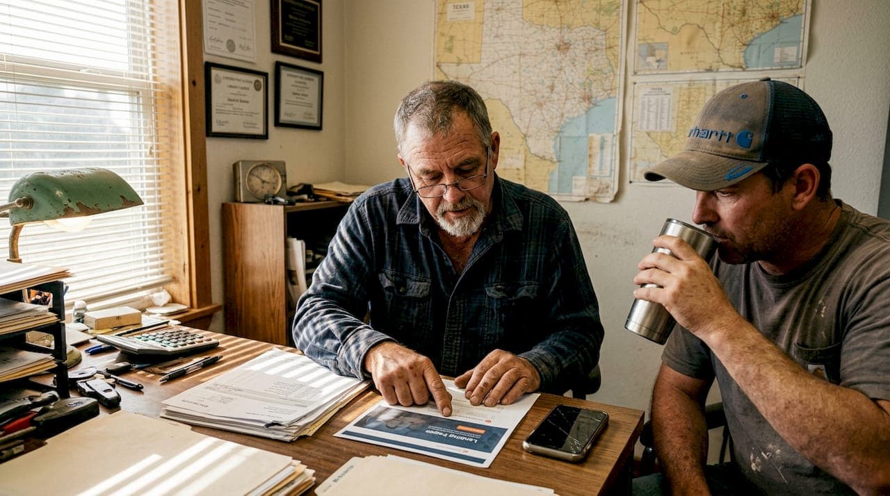
Example 1: Local contractor lead capture page
With a clear sense of what works, let's look at a real-world example starting with a lead generation page for contractors.
Contractors in Texas need leads fast. A focused lead capture page is one of the highest-converting formats available. The structure is simple, which is exactly why it works.
Here is how an effective contractor landing page is built:
- Hero image or photo of real work showing a completed job in a local neighborhood
- Bold, specific headline such as "Roof repairs in Lubbock done in 24 hours"
- Three-field form asking for name, phone number, and zip code
- One strong CTA button in a contrasting color saying "Get my free estimate"
- Two or three short customer testimonials with first name and city
Each section does a specific job. The hero image builds instant credibility. The headline answers "Why you?" before the visitor even scrolls. The short form removes friction. The testimonials remove doubt.
Short, focused landing pages outperform longer pages by 13.5%. That means adding more content is not always better. In fact, for service providers like plumbers, electricians, and HVAC companies, a single-scroll page outperforms a multi-section website every time.
The key principle here is that a visitor landing on this page from a Google ad or local search already has a problem. They need someone now. Your page should speak directly to that urgency without distracting them.
For more on building pages your clients connect with, see this client-focused web design guide built for local businesses.
Pro Tip: Use a real photo of your team or a local job site rather than stock images. Visitors in your area will recognize the surroundings, and that local connection builds trust faster than any generic photo.
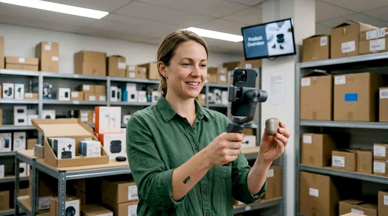
Example 2: Product landing page for a local retailer
Let's explore an example built to highlight products, showing tactics Texas retailers can use right away.
A product landing page works differently from a lead capture page. The visitor is closer to buying, but they need a little more reassurance. The goal here is to make the decision feel easy and safe.
Features that drive action on a product landing page:
- High-quality product image from multiple angles
- Short explainer video showing the product in use (30 to 60 seconds is ideal)
- Trust badges such as "Locally made," "Free returns," or "5-star rated"
- Local pickup or delivery info to reduce hesitation for area shoppers
- One clear CTA like "Order now" or "Pick up today"
- Two or three short customer quotes with specific outcomes
Stat callout: Adding a product explainer video can increase conversions by up to 86%. That is not a small improvement. For a small retailer, this single change could mean the difference between breaking even and having a profitable month.
The video does not need to be professionally produced. A clear, well-lit 45-second clip filmed on a smartphone showing how your product works or what it looks like in person can outperform an expensive commercial. Authenticity connects with local buyers.
For a physical or hybrid storefront, this page format works whether you sell online only or offer in-store pickup. Add your store address and hours near the bottom so nearby shoppers can find you easily.
Check out the essentials for small business sites to make sure your product page has every trust element in place.
Example 3: Simple landing page using a no-code builder
Another popular and affordable option for local entrepreneurs is to use easy, do-it-yourself landing page tools.
Not every business owner has time to hire a designer or wait weeks for a custom page. No-code tools let you launch a professional-looking landing page in hours using pre-built layouts. Platforms that offer solid landing page templates give you a starting point that is already optimized.
Single-focus pages built with no-code tools convert 25% better than cluttered multi-purpose pages, and they cost a fraction of custom builds.
| Feature | DIY no-code builder | Custom build |
|---|---|---|
| Setup time | Hours to days | Days to weeks |
| Cost | Low (free to $50/mo) | Medium to high |
| Customization | Template-limited | Fully flexible |
| Technical skill needed | Minimal | Moderate to high |
| Best for | Quick launches, testing | Long-term, branded sites |
The table shows that no-code tools win on speed and cost. Custom builds win on flexibility and brand control. For most small businesses testing a new offer, starting with a no-code page is the smarter move.
Before committing to a DIY tool, read about common DIY site builder pitfalls so you avoid wasted time. And when you are ready to scale up, compare website pricing for small businesses to find an option that fits your budget.
Pro Tip: The single highest-return change you can make on any landing page is to A/B test your headline. Write two versions, run them for two weeks, and keep the winner. Most no-code tools have this feature built in.
Side-by-side comparison of landing page types
Having broken down each example, here is a summarized look showing how each fits different needs.
| Landing page type | Setup time | Est. cost | Best use case | Key conversion feature |
|---|---|---|---|---|
| Contractor lead capture | 1 to 3 days | Low | Service businesses | Short form + strong CTA |
| Product page | 2 to 5 days | Low to medium | Retailers, product sellers | Video + trust badges |
| DIY no-code page | Hours | Very low | Any business, fast testing | Template layout + speed |
Use this table to match your business type with the right format. But picking the format is only step one. Here are tips for choosing the right template based on your goal:
- Lead generation: Use a contractor-style page with a short form and local visuals
- Product sales: Use a product page with video and guarantees
- Event signups: Use a single-column layout with a countdown timer and one CTA
- Service packages: Use a comparison layout that shows what each package includes
- Free consultations: Use a simple page with a calendar booking embed
A/B testing headlines can boost results by up to 34%. That means once you pick your template, your next job is testing. Never assume your first headline is your best one.
For guidance on when to refresh your page design, read this website redesign advice built specifically for small business owners.
A local expert's perspective: What most landing page roundups miss
Most landing page lists you find online show examples from Shopify, Airbnb, or other national brands. Those pages are polished, yes. But they are built with million-dollar marketing budgets and months of testing. Copying them wholesale is one of the most common marketing mistakes local businesses make.
What actually moves the needle for a small business in Texas is specificity. We have seen a local service company go from a handful of leads per month to double that, simply by swapping a generic headline like "We are here to help" for one that said "Same-day AC repair in Abilene, Texas." That combined with cutting their form from seven fields to three drove a measurable lift in conversions.
Testing headlines can deliver a 34% increase in conversion rates. That is not a reason to spend months on a redesign. It is a reason to spend 20 minutes writing a second headline and letting the data decide.
"The best landing page is not the prettiest one. It is the one your specific customer reads and immediately thinks: this is exactly what I need."
Small experiments beat big redesigns every time. Swap the headline. Remove the nav. Shorten the form. Test one thing at a time and keep what works.
Get hands-on help for your landing page
If you are ready to apply these lessons and see real results for your own business, here is how Digital Biz Agent can help.
Digital Biz Agent works with small Texas businesses every day to build landing pages that are focused, fast, and built to convert. You can browse more landing page examples to see what a clean, local-first design looks like in practice. When you are ready to move forward, explore the full range of website design services available at pricing that makes sense for small businesses. Plans start at $25 per month. Not sure where to begin? Start with the website must-haves guide and reach out for a free demo when you are ready.
Frequently asked questions
What is the most important feature for a landing page to convert well?
A clear, specific headline and a single, focused call to action have the biggest impact on landing page conversions. Tested headlines alone can increase conversions by 34%.
How many form fields should I use on my landing page?
Keep it to three fields whenever possible. 3-field forms reach a 25% conversion rate, while forms with more than five fields see a sharp drop in completions.
Are no-code landing page builders effective for small businesses?
Yes. No-code builders and templates allow small businesses to launch effective, conversion-ready pages quickly without technical expertise or large upfront costs.
Should I use video on my landing page?
Absolutely. Including a short explainer video can boost your conversion rate by up to 86%, making it one of the highest-return additions you can make to any landing page.